The double page spread was designed in the way which my focus group preferred, therefore when creating it I took into consideration their thoughts and preferences.
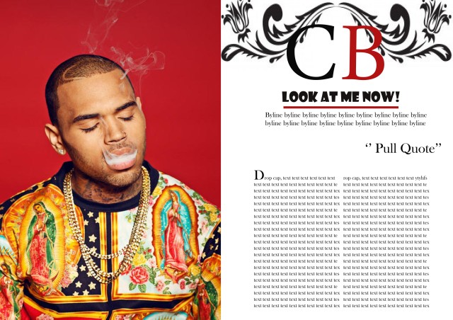
The first page of the double page spread is a whole photo of the artist that is being introduced, by having the first page being all about an artists image, it appeals to the demographic as there is not simply a small photo on the page and then the rest of the double page spread is writing, therefore it appeals to the audience as it is equalled out. Also the audience could possible use this page as a poster if they wished too.
A double page spread is meant to advertise the artist in their own way, therefore the next page is all about them, in the way that they portray themselves as. This appeals to the audience as if they are fans of Chris Brown they will want him to be portrayed in a way, they fits with him. Therefore his initials are at the top of the page; this can be seen as his logo, which will appeal to the audience as this font will straight away link them too the artist. The title is ‘Look at me’, this uses intertextuality as one of his songs is called ‘Look at me now’, by using play on words, the title will then link to the text and appeal to the audience as it is fun and relatable to the artist therefore fans of the artist will enjoy this. The page then includes a by-line which gives the demographic a bit of information about the article and the artist, a pull quote is then used to show the demographic what the article is about and by using an interesting pull quote it will then make the demographic wish to read. The double page then uses simple conventions like a drop cap and columns as usual magazines include these. The colour scheme of the page all revolves around the main image.
