Magazine Analysis’ Evaluation

Through close analysis of Hip-Hop & RnB magazines, I have received a good assumption of what the typical Hip-Hop magazine introduces within it. I have come to a conclusion of how this genre magazine portrays certain genders and classes and how they portray them in the sense of stereotypes, ideologies  and how they appeal to the audience through the use of conventions and layout choices.

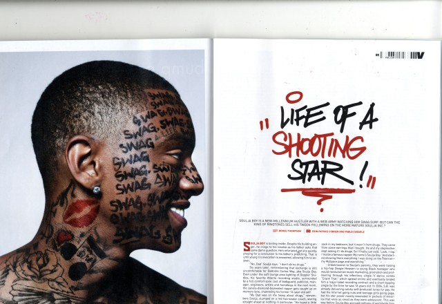
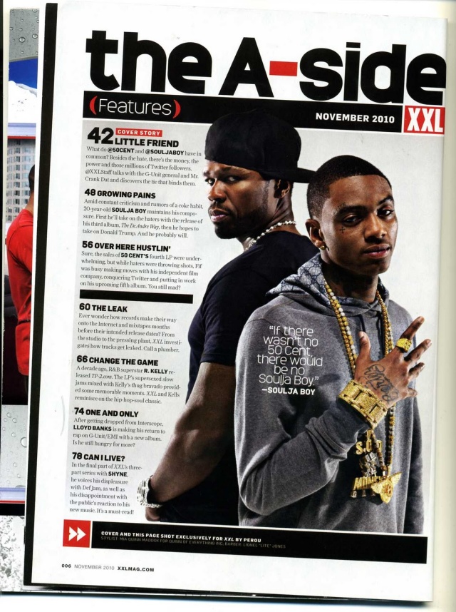
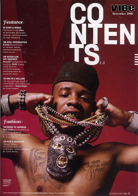
For starters within the front cover of the genres magazine, they mostly use male artists to be the cover model showing the genre of music is quite masculine. When having male artists on the front cover of a Hip Hop magazine they portray them in the stereotypical rappers way, having them look hostile whilst covered in jewellery, they reinforce the lifestyle that these artists have and one that everyone should possibly have or want, one of being rich and flash. They reinforce the dominant ideology that rappers have tattoos by doing this the artist is usually topless. The rappers are usually portrayed in a thug way almost as if they are a threat to someone; however when the artist is then portrayed on a different genre of music magazine- i.e. Rolling Stones a rock magazine – the artist is then portrayed in a way that fits the new genre. For example when artist Lil Wayne is on a Hip Hop magazine he is portrayed in the stereotypical rapper way, looking like a thug, however when on the front cover of Rolling Stones magazine he is portrayed in a more thoughtful rocker way, wearing similar hats and not as much jewellery. Therefore this shows that the artists are portrayed in a way that will appeal to the audience of the certain genre magazine. Juxtaposed to this, depending on the message they are trying to send to the audience, they may change some of the stereotypes that they portray on their average front cover. For instance on an issue of The Source magazine the cover line being ‘New Coming Of Age’ they then adjusted the cover models to fit the cover line presenting them in a way that isn’t all of the usual stereotypes that we assume of the genre.

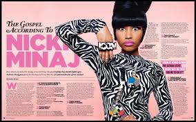
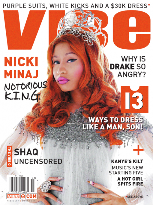
Furthermore, when deciding to have a woman artist –usually of the RnB genre- on the front cover, they use the male gaze theory and sexualize them, they do this to keep the magazine masculine in some ways as it will still bring in the male audience however it brings in a woman audience appealing to them as they may idolize the artist. However when choosing to have a woman of a Hip Hop genre as the cover model, they create a vibe to the audience making the female artist quite masculine, having a strong pose that shows they are a part of the masculine genre therefore they will abide by the stereotypes.

Henceforward, with the use of cover lines the magazine reinforces and hostile vibe and powerful and rich lifestyle. The magazine does not use many conventions like push buttons, footers interrogatives as they keep their front cover simple in the sense of conventions making sure the front cover is not too busy, they simply give the audience awareness of all the articles that will be introduced in the magazine. More so, the magazine front cover always uses anchorage to link the top article with the image they do this to interest the reader. However whilst keeping the front covers simple, they use the space wisely making the page still look filled, without making the front cover too busy.

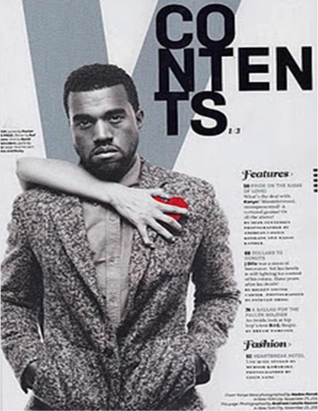
Meanwhile, my genres magazine keeps their contents pages conventions and layout choices very similar. I have grasped that the magazines main focus for their contents page is not the writing telling the audience what page is where but the lead image is. On all contents pages I had analysed the lead image in the focus of the magazine, the lead image is usually of artists who have a top story in the issue and in some cases they will use a pull quote from the artists’ article. The writing is usually located close to the lead image however it is usually in quite a small font, some may suggest they do this to emphasise on the lead image however, the writing is easy to locate and in an easy enough font to read. All magazines contents pages that I had analysed all used a heading which the magazine consistently used in all of their issues. This would give their content pages and magazine a brand identity as the audience would recognize these traits as being apart of a certain magazine. This genre keeps their contents pages very simple, they use conventions like footers to give credit to the photographer of the lead image. They also tell the reader the date of issue and in some cases what issue it is.

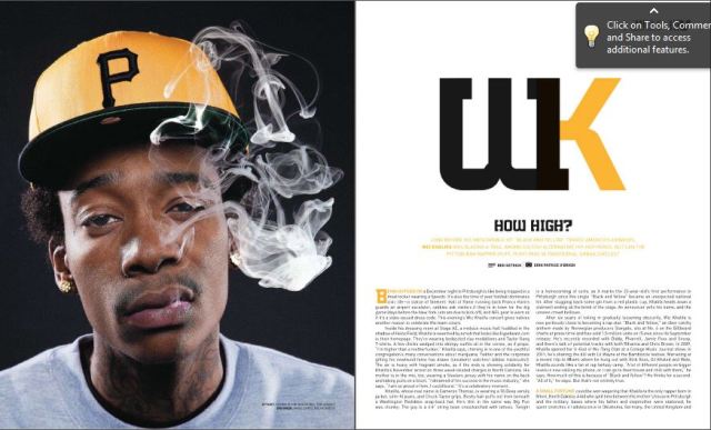
Henceforward, after analysing multiple double page spreads, I have realised that they all use certain conventions and layout devices in similar ways. For starters, with the article being surrounded on a certain artist the first page of the spread is usually a picture of the artist, the photo either supports the title of the double page spread or simply supports the way the artist is usually portrayed using devices like anchorage or intertextuality, for example on a Wiz Khalifa article they dressed the artist in black and yellow as he has a #1 song named Black & Yellow. Furthermore, in some cases they create a colour code that also fits with the artist as this will appeal to the audience as it creates realism to the article as this is what they would expect the article to be like. I have grasped that when creating a double page spread they create all the conventions and layout choices of the magazine to be about and to relate to the chosen artists therefore the headings a subtitles will be written in the style of the artists and even worded in a way that would relate to the artist. The magazine makes sure that the double page spreads all fit in well with the colour code the writing and to create a really good vibe to the magazine, this appeals to the audience as if they are a fan of the artist the double page spread is basically a little profile of the artist to them. More so, the magazine uses only a few other conventions like the use of a drop cap and columns, these are simple conventions that are portrayed in very many different types of magazines. Therefore, when creating double page spreads they create a page that fits in with the artist making it appeal to the audience.

Consequently, from analysing different Hip-Hop magazine and learning how they portray certain stereotypes through conventions and layouts I now have inspiration and the knowledge to be able to create my own magazine in this genre.

Magazine Double Page Spread Analysis

Magazine Double Page Spread Analysis

This double page spread is from a Hip-Hop/RnB music magazine. The double page spread uses many conventions and layout choices that a typical double page spread would have.
Firstly, the page uses the lead image to decide where the articles writing will be displayed around the lead image to emphasise on the lead image as it appeals to the reader telling them who the article is about without having to read the article. The lead image is Nicki Minaj, they present Nicki Minaj in a way that she as an artist portrays herself as this again will then appeal to the audience and her fan base as it gives realism to the article as they article is portraying her as she seems to her fan base. Therefore, they dress Nicki Minaj in crazy clothing, she wears a ‘Icon’ ring as they use anchorage as they talk about how she is seen as an idol to many, her stance and pose within the magazine to reinforces to the audience the way Nicki Minaj portrays herself as quite a quirky, crazy artist.
The colour code the magazine choose to use ‘pink’ as it uses intertexuality as Nicki Minaj calls herself the title of ‘Barbie’ therefore by using this as the main colour it reinforces the title that she gives herself again appealing to her fan base as they would expect pink to be the colour used instead of red or green. The title on the page ‘The Gospel According To Nicki Minaj’ gives the reader a sense of what the article is going to be about and they again make sure they have her name in Pink to again reinforce the idea that she is Barbie as that is the title she gives herself.
Henceforward, the double page spread uses conventions like a steadfast; this tells the reader a bit of information about the artist and article in case the readers do not know this artist or want a bit of information about the article before having to read it all. The page too uses a by line to give credit to the photographer and writer of this article, they keep the writing small as the readers may not be interested in this information however, they still have to give credit to the audience.
Furthermore, the creators of this double page spread have used pull quotes on the page; this gives the reader suspense as by giving an interesting pull quote the reader will know want to know the rest of the article to find out what it was about.
Finally, the magazine uses simple conventions like using drop caps as it makes the articles look more official as most magazine use these conventions. More so, the magazine uses columns however in this article they have heading as well, this appeals to the reader as they can take breaks mid-way through reading the article. Also they can skip certain parts of the article is they wanted too.
Therefore, with all these convention and layout choices, it appeals and brings the reader in making it easy for them to read, and being able to relate to it.

Magazines Double Page Spread Analysis

Magazines Double Page Spread Analysis

This double page spread is from a Hip Hop genre magazine. The magazine uses the same layout of having the lead image using a whole page of the double page spread, which is again located on the left hand side. This magazine the artist Soulja Boy does not used direct mode of address they possibly do this to emphasise on the writing on his face and to show his tattoos, by showing of his tattoos this reinforces the ideology of rappers being covered in tattoos. These leading images challenges the ideology and stereotype of how rappers are hostile and always look rather angry, they may have done this as it then fits in with the article itself, of Soulja Boy almost celebrating and boasting about his current lifestyle and how well he is doing in his career. This will appeal to the audience as it does not fit in with the usual stereotypes of rappers being angry.
The pages title uses graffiti font which fits in with the style and genre of the magazine, as graffiti can connote the streets and ghetto the colour choices of red and black too show this as the may represent blood and darkness. The double page spreads uses the usual conventions of a steadfast, this appeals to the reader as it gives them some information about Soulja Boy and about the article which they can find out before reading the article. The page too uses a by line which gives credit to the photographers and writers of the article, it is always small as the audience may not be really interested in this information however the magazine still has to give credit to them. They also use a drop cap and columns as most magazine use these conventions therefore they are seen as the normal and comfortable thing to have for readers.
All these choices of conventions and layout is what appeals to the reader and entices them to read the article.

The Source Magazine Double Page Spread Analysis

The Source Magazine Double Page Spread Analysis

This double page spread is from the magazine The Source which is a Hip Hop magazine. The lead image on this spread is of two artists, Soulja Boy and 50 cent. From the poses and hostile mode of address giving from the artists reinforce the stereotypical view on rappers of how they are angry and thug like; this will appeal to the audience as this is how they view these artists. They do this too with the way the artists have a lot of jewellery reinforcing the rich lifestyle and stereotype of how rappers are flash with all their big chains of jewellery. They use anchorage as they link the text with the lead image; 50 Cent saying he is the almost guardian of Soulja boy, therefore he stands in the background of the image in a protective stance, which Soulja Boy shows quite a cocky stance, this again appeals to the audience as it fits in with the context and as the was the front cover story, it fits in well with it and stays consistent with the front cover.
The double page spread uses the typical conventions and layout choices as many double page spreads from other magazine. The lead image always uses up a page and that page is always the one on the left hand side. The magazine uses a pull out quote as the title, as the pull out quote is very explicit this creates suspense to the reader as it will definitely make them want to read on. Most magazine would not use swear words within promoting an articles title however as this is a Hip Hop magazine they will promote it as it fits the genre very much, this then appeals to the audience as the magazine does not hold back.
This double page spread is very basic as it does not have a steadfast, by line or drop cap which most magazine do include in their double page spreads. The magazine uses the usual layout choice of placing their text in columns, this makes the page easier to read as it is neater and this is the typical way to layout the writing on a double page spread.
All these conventions are what draws the audience in and these devices makes the reader actually read the column.

Double Page Spread Analysis

Double Page Spread Analysis

This double page spread is from a Hip Hop Magazine. In this double spread they use one of the pages to promote the artist by making the whole photo be the artist. By doing this it appeals to the audience as they could use this page as a poster if they wanted to. By having the lead image a photo of the artist ‘Wiz Khalifa’ it shows the article is very much about them. They use intertextuality to portray the artist to make him look to the audience how he portrays himself in his music, for example Wiz Khalifa consistently in his music talks about getting high and smoking week, therefore they have made Wiz Khalifa have smoke coming out of his mouth. This appeals to not only the target audience but the artists fan base as the images and article fits with the way Wiz Khalifa is portrayed. This too reinforces the ideology of rappers smoking and taking drugs. Wiz Khalifa shows a hostile direct mode of address, this again reinforces the way a stereotypical rapper is seen, however the artist may not be a hostile person at all. This appeals to the audience as the magazine shows the genre all the way through.
The magazine again uses intertextuality when it comes to the choice of colour code, by choosing the background of the lead image to be black and the artists hat to be yellow as well as the writing and heading fitting this fits in with the artist as Wiz Khalifa’s #1 song is called Black & Yellow and it is what he is known for. Therefore this appeals to his fan base as it links his work in with the article and makes it more interesting and fun in some ways for the audience.
Henceforward, the magazine keeps the title very simple, they use Wiz Khalifa’s trademark initials using the colour code of black and yellow again to indicate his song Black & Yellow and to promote Wiz Khalifa not only as an artist but as a brand also. The magazine uses a heading of ‘How High’ by using alliteration this intrigues the audience and it also interests them as the questions is based around the artists personality of how he is portrayed, therefore it reinforces the rapper lifestyle which appeals to the audience. The use of a steadfast tells the audience a bit about the artist the article, this appeals to the reader as they learn if the article is going to be interesting to them without having to read the whole article. Furthermore, they use other typical conventions like a by line which gives credit to the photographer and writer of the article, it is in small writing as to the reader it most likely will not interest them however they still have to give credit to those who created the article. Lastly the magazine used a drop cap at the beginning of an article and use the layout of columns as these two conventions are the typical way to have your text in your magazine also by having columns it is neater and looks better on the page instead of having a normal paragraph layout.
All these conventions and use of layout on a double page spread appeals to the reader as these conventions and layout choices are normal to them as most magazines do the same. The audience are interested as a star is introduced on the article and they learn a lot of information.

Source Magazine Contents Analysis

scan-23-e1359373778724

This is a contents page from the magazine The Source, which is a Hip Hop magazine.
Source magazine keep their contents page rather simple, which I believe looks better than there being too much on the page. Source magazine always use very dull colours on their contents pages. Usually using black and red, these colours are usually featured on Hip-Hop genre magazines as to colours can represent a tough and expensive feel, which is what we think of when we think of rappers and hip hop music.

Source magazine consistently uses the title ‘Master Plan’ we can suggest they do this as by having the same title it creates a trade mark to the magazine, therefore if the target audience here the phrase ‘Master Plan’ they will automatically think of Source magazine contents page. Furthermore, Source magazine always states at the top of the contents page, the issue number, this appeals to the audience for multiple reasons, firstly it gives the audience a sense of how long the magazine has been around ( if the magazine comes out monthly and they are on issue 256 the magazine has obviously been out for quite awhile) also some of the audience may collect the magazine, this will tell them what issue it is and tell them which of their magazines came out before others. By having the issue number it makes the magazine very organised and official.

Henceforward, the contents pages main focus is the main image, as on each issue they show a artists who is big at the moment, they use star appeal to grab the reader in, by having ‘Kendrick Lamar’ on the front cover this will appeal to the reader making them know that there is a article about them further on in the magazine.
Kendrick Lamar is seen as a very down to earth artist he doesn’t really fit in with the dominant stereotypes of rappers being over the top with jewellery and having gold teeth etc. Therefore they have to some extent emphasised on this with the mis-en scene of Kendrick Lamar with the way they have dressed him, instead of putting him in bright baggy clothing and making him show off tattoos and even having him topless (which is the ideological view on rappers) they have presented Kendrick Lamar in a very simple way putting him in black clothes and even giving him black jewellery. They have still given Kendrick Lamar Jewellery to reinforce the rich lifestyle that rappers have, however they do to some extent challenge the ideology of how rappers are draped in gold and silver jewellery over the top almost. This appeals to the target audience as the magazine is portraying Kendrick Lamar in a way that the audience views him as and knows him to be. This makes the magazine more believable and not fake. They dress Kendrick Lamar all in black and having less jewellery as this then emphasises on the crown on his head and the message they are trying to send within that. As Kendrick Lamar is in the element of his career some address him and have called him the King of Hip-Hop and the ‘New Generation of Hip Hop’, therefore by having the crown, it uses intertextuality as the audience knows what the crown on his head means straight away. It also gives the audience a sense of what the article about him is going to be about. Kendrick Lamar shows a hostile direct mode of address, this fits in with the crown on the head as Kendrick Lamar gives us the feeling that he is high up in the game.

Throughout all of Source Magazines contents pages, they place the writing (which tells audience which page of the magazine is what) near to the main image, sometimes even overlapping slightly, by having the writing so close to the main image this will make the audience spot the writing as they will firstly navigate to the main image within the focus, soon spotting writing.

Source magazine use the same layout and conventions choices on their contents pages as it creates a brand identity to the target audience, it make them comfortable and familiar with the magazine as they are used to the way the magazine is set out therefore it is easier for them to navigate around the contents page and find the information they are looking for.

XXL Magazine Contents Page Analysis

XXL Magazine Contents Page Analysis

This contents page is from XXL magazine which is a Hip Hop magazine.
XXL magazine do not use the usual title for their contents page, the usual title would be the word ‘contents ‘ however on XXL magazine they consistently use the title ‘The A Side’, which is telling the audience this is where they will find out where everything is. By consistently using this title it creates a trademark to the magazine and appeals to the audience as they will feel comfortable with the way the magazine keeps its usual conventions.
XXL magazine always use the same colour code of White Black and Red, this then fits in with the Logo of the magazine on the front cover (XXL being in a red block in white writing), with these colours, it keeps the magazine consistent and not confusing by having to many colours throughout the magazine. It too gives a quite rich and powerful vibe as these colours together are neutral and connote things like darkness blood which are quite tough and fit in with the genre of Hip-Hop and how the artists are portrayed, it would not appeal as well if the colours where for example green or yellow. By having a consistent colour scheme this creates a brands identity as these colours in a magazine will remind the audience of XXL Magazine.
Furthermore, the main image on the contents is the main focus, the image uses anchorage as on top of the image there is a pull quote from an article within the magazine, it explains why the photo is the way it is and why there is more than one person on the contents (who are not in a band or group). By using anchorage and making it a pull quote it appeals to the audience as they now get an inside of what the article is going to be about, which they might find of interest.
Henceforward, the magazine reinforces the ideology of the bad boy thug image of rappers, as they portray the stereotypes within the pose of the 50 Cent and Soulja Boy. By having both rappers in jewellery this reinforces a certain lifestyle to the audience, not necessarily one they have to abide by, but one that fits in with this genre. They also reinforce the stereotypical image of rappers by showing of Soulja Boys tattoo on his hand.
Both rappers display a hostile mode of address to again reinforce the stereotypical rappers image. Their poses are as well quite hostile and threatening, some may even say boss like (for 50 Cent). By portraying these rappers in these ways it appeals to the target audience as this is what they expect to see from a rapper and those of the Hip Hop genre and this is the way they are portrayed therefore they have to abide by these rules to appeal to their target audience.
More so, the magazine uses a similar layout as Vibe magazine (in my previous analysis’) as their writing around the cover model and keep it to one side of the page instead of scattering it around the page, this is appealing to the audience as it is easy to navigate around the page and find what they are looking for. They keep the writing rather small, we can only suggest they do this as they believe pictures are more interesting and speak more words, therefore they want to emphasis and focus on the photo more, as the ideal demographic may prefer pictures and small quotes to a page full of writing, therefore they keep it small and to one side. They use short and snappy headings for each description of the different pages within the magazine. This makes it more interesting to the reader as it will make them want to see what they heading means and then read on or then locate to the page it is on.
Lastly the magazine uses footer on the page to show a short sentence to tell the audience and give credit to the photographer who did the photo shoot with the rappers. They do this to give credit to the photographer as it is only fair, they have the writing small as the audience are not really interested in this information; however XXL magazine still have to put it there.
Therefore, all these layout choices and conventions used appeal to the audience as by having the contents page consistent in all their magazines it creates a brands identity and gets the audience used to the magazine and makes them more familiar with it.

Vibe Magazine Contents Page Analysis

Vibe Magazine Contents Page Analysis

This contents page is too from Vibe magazine. The cover model is Kanye West.
As we can tell from looking at the previous contents page analysis from Vibe magazine we can see how they maintain the same style layout within their contents pages, they simple rearrange the positions of certain parts slightly to then fit well with the main image.
Therefore, on this contents page they again, show a ‘V’ in the background to show this is a Vibe magazine contents page, and create a brand identity to the magazine as all their magazine contents pages have the ‘V’ in the background. This appeals to the audience as they begin to get comfortable with the usual layout choices of the magazine.
The colour code of this contents page is greyscale and black and white, we can suggest they do this to reinforce a certain lifestyle, as when we think of black and white, we could think of formal wear which could also reinforce to us quite a rich lifestyle. Juxtaposed to this by the use of the colours being greyscale this emphasises on the red heart on Kanye West. When we look closely to the heart we realise there is a woman’s hand trying to grab the heart. The usual connotation of red hearts would be love, and as there is a woman trying to take his heart his expression shows quite a negative mode address as if he is not happy about love or someone taking his heart. They use intertextuality as at the time of this contents page Kanye Wests ideological view of women is to be heartless and heartbreakers and at this time the mood of his songs fit this with hit singles called heartless, love lockdown etc. Therefore portraying Kanye West in this way this appeals to the audience as they know this is how they view Kanye West and what element within his music he is in.
In the last contents page analysis they showed the usual stereotyped of rappers –having many tattoos and a lot of jewellery on. However in this cover they portray Kanye West in a more mature gentleman way, having him in a suit, this could be because Kanye West has never portrayed himself in the typical rapper stereotyped way, therefore he challenges the dominant ideology of rappers being thug like. This will appeal to the audience as it will show them you don’t have to be a certain way to enjoy this magazine, as long as you love the music that is all that matters.
Furthermore, Vibe magazine use their usual layout choices on the magazine; they use the same font and font size for their title ‘contents’, they also locate the writing on the right of the page in small writing, they may do this as by having small writing it does not take the focus of the main image, also we can suggest that most people do not really read the whole contents page, therefore there is no need for the writing to be massive.
Therefore, by Vibe magazine keeping the same layout choices to the magazine this get the audience comfortable with the way the magazine is set out, and makes it easier for them to read the magazine and creates a brand identity to the magazine, making them different from all the other music magazines.

Vibe Magazine Contents Page Analysis

Vibe Magazine Contents Page Analysis

This contents page is from the magazine Vibe, this is their December issue 2008.
Vibe consistently show a ‘V’ on the page which blends in with the background used. They do this too almost create a brand for their magazine, by keeping the same layout choices this will appeal to the audience as from seeing this contents page they will know straight away that this is a contents page from Vibe magazine. They also keep the same styled font and font size on the contents page to also create a brand identity to the demographic.
Henceforward, the iconography of the main image still reinforces the genre of the magazine and reinforces the dominant ideology that rappers are thug like, with plenty tattoos (hence why they have made the rapper topless). The model also has lots of jewellery and diamonds on him, this too reinforces a few dominant ideologies, one being that having money is happiness and also that rappers are usually stereotyped as having lots of jewelry to the point where they are showing off. By reinforcing dominant ideologies and stereotypes within the contents page it shows that they do not just portray these things on the front cover; it is all the way through the magazine. Also it shows the audience the genre of the magazine and appeals to them as this is what they expect to see even if they are false stereotypes.
The writing is all placed to revolve around the main image as some may say the main image is what creates appeal to the contents page otherwise it would just be writing on the page. Therefore they have done a close up on the model –plies- therefore we can focus on him and realise all the stereotypes that are portrayed, they use star appeal.
The writing is located on the left of the page, it is styled in a block/ list type of way. This makes it easy for the audience to find and is better than having the writing scattered all over the page not making it appealing to read. The list writing it typically small compared to everything else on the page, we can suggest they do this as many people may not actually read the contents page as they are genuinely interested in the whole magazine therefore they focus on the main image and showing the demographic that this is a Vibe magazine contents page.
More so, when we look closely at what is written on the contents page, they do not tell us every article that is within the magazine, they simply tell us the main features in the magazine and the fashion side of the magazine. They may do this to separate the two sections of the magazine as some people may not want to read the fashion articles however they tell us the different features within the magazine, so the demographic can look to see a certain feature they may have been waiting to read.
All these conventions and choices to the contents page that Vibe consistently show appeals to the audience as is creates a brand identity to them, as will be ‘comfortable’ to them as they are used to this layout.

Vibe Magazine Front Cover Analysis #3

Vibe Magazine Front Cover Analysis #3

On this cover of magazine Nicki Minaj is the cover model. They allow the cover photo to cover the magazines name, this shows that the cover model is well known and famous, this also shows us that Vibe magazine is a very well known magazine as they will allow themselves to cover their name to promote a celebrity and they have no worries that the audience will not recognise that it is still vibe magazine.
The cover model uses direct mode of address to engage the audience as if the model is looking and talking to them. The use of mis-en scene and they way they have dressed Nicki Minaj the way they have links in with the cover line next to her. Nicki Minaj is presented in a royal was as she is covered up fully and is wearing a crown, her pose is also in a very royal stance. This is anchorage within the text as the text says ‘Nicki Minaj Notorious K.I.N.G’; this explains why Nicki Minaj is dressed and posed this way. However the cover line says ‘Notorious King’ instead of saying Notorious Queen as she is a woman. This is telling us that she in the same league and competition as then men and that she is just as good as the men. This challenges the ideologies that men are more dominant then women and how men are better at everything. However this does fit in with the way rap music is stereotyped as being quite manly music and aggressive therefore with Nicki Minaj being a rap artist, and being a woman they would have to portray her as being quite tough and manly but at the same time keeping her seductive and as a female should be. This will appeal to the audience as it challenges stereotypes and will also appeal to women as a woman is on the cover of a manly genre of a music magazine and how Nicki Minaj has not being sexualized in any way.
Vibe magazine makes the colour code fit in with the colours used for the cover photo; this keeps everything simple and makes nothing overpower anything else. This appeals to the audience as it is simple. Vibe magazine uses any conventions that a typical magazine uses; they have a skyline to promote what interesting articles are inside. They also have a range of different cover lines spotted around the page to give the reader a lot to look at and to show them very many different articles that are inside. They have used bold font on certain words within a cover line to show the audience what the most important part of the article is ‘Why is Drake so angry?’ this emphasises on the article and draws the audience straight to the name Drake creating suspense on what the article may be about.
The use of layout and conventions help to make the magazine appeal to this audience and draw the demographic in.