This double page spread is from a Hip-Hop/RnB music magazine. The double page spread uses many conventions and layout choices that a typical double page spread would have.
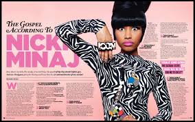
Firstly, the page uses the lead image to decide where the articles writing will be displayed around the lead image to emphasise on the lead image as it appeals to the reader telling them who the article is about without having to read the article. The lead image is Nicki Minaj, they present Nicki Minaj in a way that she as an artist portrays herself as this again will then appeal to the audience and her fan base as it gives realism to the article as they article is portraying her as she seems to her fan base. Therefore, they dress Nicki Minaj in crazy clothing, she wears a ‘Icon’ ring as they use anchorage as they talk about how she is seen as an idol to many, her stance and pose within the magazine to reinforces to the audience the way Nicki Minaj portrays herself as quite a quirky, crazy artist.
The colour code the magazine choose to use ‘pink’ as it uses intertexuality as Nicki Minaj calls herself the title of ‘Barbie’ therefore by using this as the main colour it reinforces the title that she gives herself again appealing to her fan base as they would expect pink to be the colour used instead of red or green. The title on the page ‘The Gospel According To Nicki Minaj’ gives the reader a sense of what the article is going to be about and they again make sure they have her name in Pink to again reinforce the idea that she is Barbie as that is the title she gives herself.
Henceforward, the double page spread uses conventions like a steadfast; this tells the reader a bit of information about the artist and article in case the readers do not know this artist or want a bit of information about the article before having to read it all. The page too uses a by line to give credit to the photographer and writer of this article, they keep the writing small as the readers may not be interested in this information however, they still have to give credit to the audience.
Furthermore, the creators of this double page spread have used pull quotes on the page; this gives the reader suspense as by giving an interesting pull quote the reader will know want to know the rest of the article to find out what it was about.
Finally, the magazine uses simple conventions like using drop caps as it makes the articles look more official as most magazine use these conventions. More so, the magazine uses columns however in this article they have heading as well, this appeals to the reader as they can take breaks mid-way through reading the article. Also they can skip certain parts of the article is they wanted too.
Therefore, with all these convention and layout choices, it appeals and brings the reader in making it easy for them to read, and being able to relate to it.
