Photo Plan

Photo Plan

I researched into several different photos, that I believed I and my demographic would like the front cover, contents and double page spreads images to be like. I got a range of different images that I thought would look great presented in Prestige magazine. Therefore when deciding what styles form and structute I would like my images to be like I will take into consideration how these photos are presented and shot. Using some of these images I have put on my photo plan I will create drafts of what my magazie will possibly be like, when I have made my final magazine. I loved the images that I had put on my photo plan as they were edgy and the iconography in the photos represented the Hip-Hop and RnB genre that my magizine will be, therefore it has giving me inspiriation on what my images should be like to capture a certain mood and genre.

Prestige Magazine Official Pitch

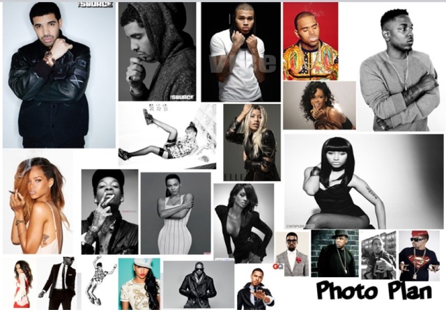
Prestige magazine is going to be a Hip-Hop & RnB genre music magazine. It will display the Hip-Hop & RnB culture throughout the issues, the demographic will see this through the articles, celebs and features that are introduced within the magazine. Prestige magazine will be a dominantly music magazine however it will too include, sports fashion and entertainment (i.e. movies) which too fit in with the Hip-Hop & RnB culture.

Prestige magazines target audience will be between the ages of 17-26 years old, however the average age that we are aiming for is 19 years, therefore the magazine will be based around that dominant age group. Prestige magazine will be around the BCD range for target audience therefore the magazine will be priced at £2-£2.50. Prestige’s demographic will relate to the magazine, as the contents within the magazine will introduce subjects that the target audience enjoy and to relate to. Prestige will ensure this by always being on top with their research in ensuring the demographic receives a magazine of the highest standards.

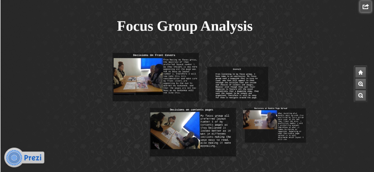
Prestige will have a unique style that will give the magazine a brand identity making it different from all the other magazines. From communicating with target audience members finding out what they too prefer, we will create a magazine that it organised, giving it the professional taste, that is still edgy and relatable to the audience. By the magazine being very organised yet edgy it will create a  calm tasteful vibe to the audience, being jam packed with the latest information but still abiding by the demographics preferences of being set out in a very simple, less busy way.

The magazine every issue will include new artist features, new music, competitions and entertainment, that the demographic will enjoy, Prestige magazine will be a magazine that makes the demographic feel comfortable, a magazine that they feel apart of, having just as much say in what goes into the magazine as we do. Once the magazine has launched a Prestige website will too launch, branching out, so the audience will be able to be apart of the magazine at all times.


Focus Group #2

I decided to do another focus group as my target audience are boys and girls therefore I would like feedback from both genders. However I wanted to present it in a simpler way as the information is the most important part to it therefore I would write down the feedback I received from my target audience.

Front Covers:

When holding my focus group I showed them my drafts layouts for my front covers, they said they preferred layout number 2 as it was more organised, they preferred the example I gave them of layout 2 instead of the example of layout 1. They said they would prefer a magazine that was not so busy on the front cover, as when they go to a shop and look for magazines to buy they automatically appeal to the magazines that look more organised as they are not so confusing to look at and to read. They said they like the cover image to be the main focal point therefore not allowing writing covering it too much (a little was ok). They also prefer the magazine not to involve too many conventions as that then leads to a front cover that is way to busy making it not appealing to the eye. With this all being said it now how shown me that boys too prefer a page that is simple and organised, for the same reasons as my previous focus group.

Contents Pages:

My focus group all agreed that they preferred layout 1 of my contents pages as again it was more organised. They said when it comes to contents pages they want a page that is not full of loads of writing as previously for them when looking at contents pages they just skip the page as there is just so much small writing included on it, they want a small quantity of writing and just a calm fun contents page that may introduce another artists photo. They want to be told what issue the magazine is and what date it has come out, as sometimes for them they have realized they sometimes buy the wrong issues of magazine getting the older issues as they have not seen a date on the magazine. This information helped me a lot as my 1st focus group too preferred layout 1 for the same reasons however this focus group has giving more depth to why they prefer it.

Double Page Spread:

My focus group said they liked layout number 1 of the double page spreads as the example giving was very calm, and presented in a really good way. All images where located in the same place and writing was too located in the same place. My focus group agreed they did not like double page spreads that had writing located all over the page as it would make it confusing to know what to read first. They also like how with one photo on one side of the spread it is more appealing and could be used as a poster. They said they like colour coordination’s and catchy titles without the page not having the be to busy and filled up with too much  going on all over the page.

This focus group helped me a lot as they too agreed with my focus group on what they liked, however they explained it into more depth, therefore now having all this information I now will be able to to create a magazine, in a appealing way that my demographic will enjoy looking at.