Prestigen Magazine Drafts Facebook Feedback #1

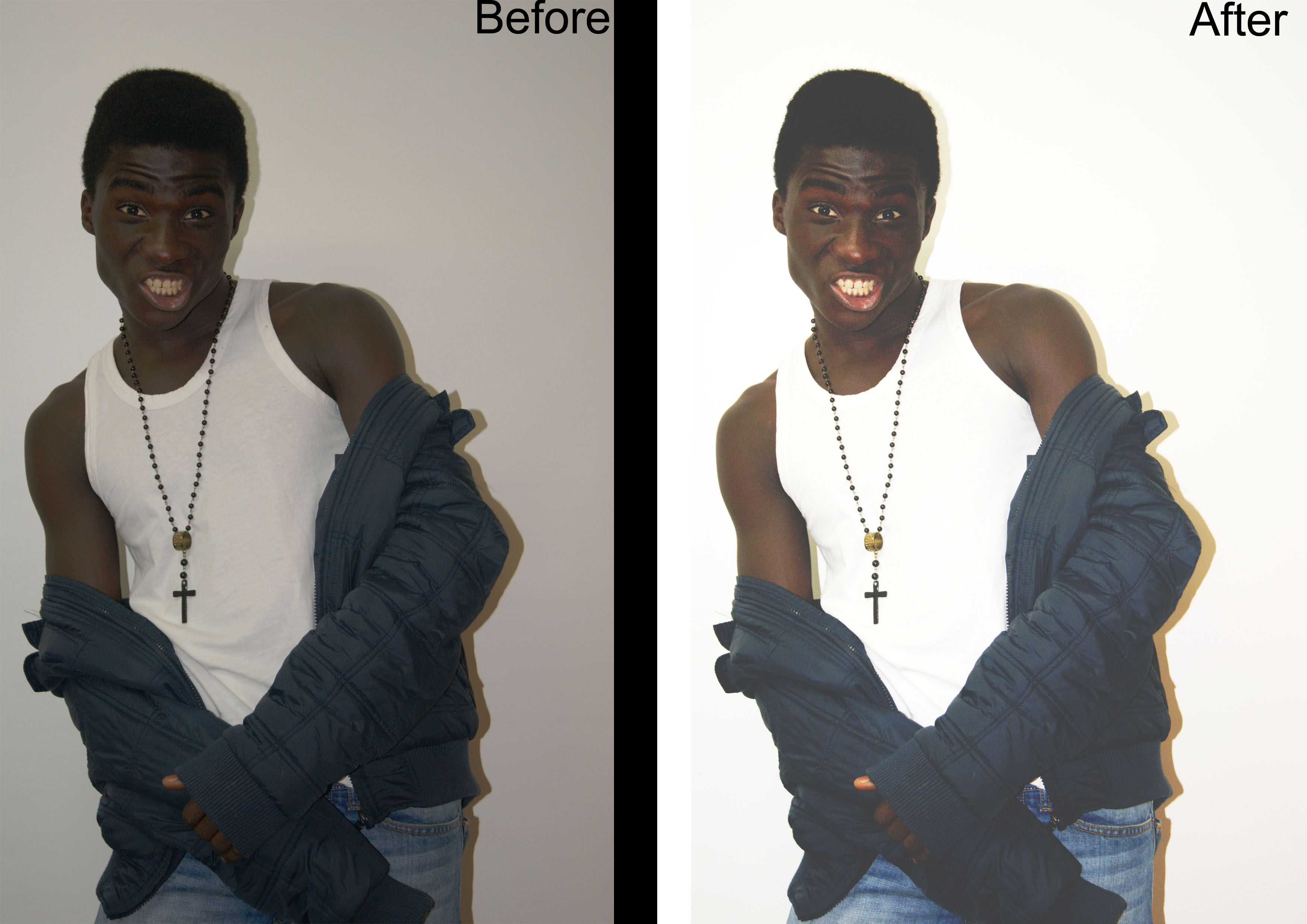
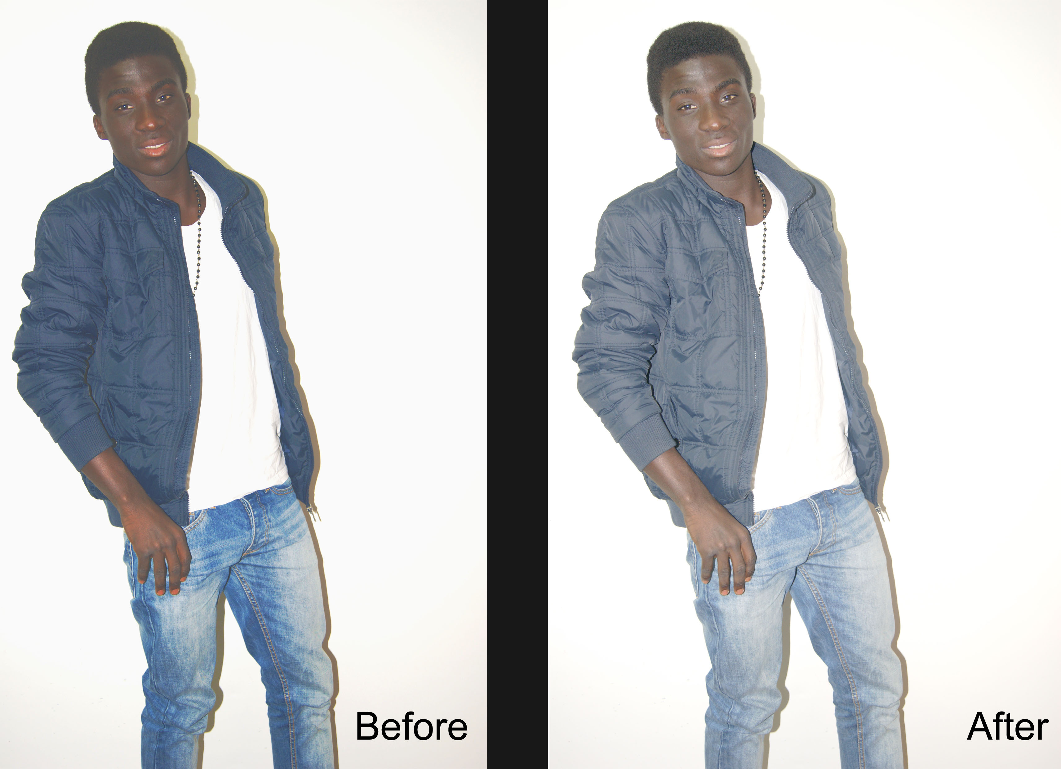
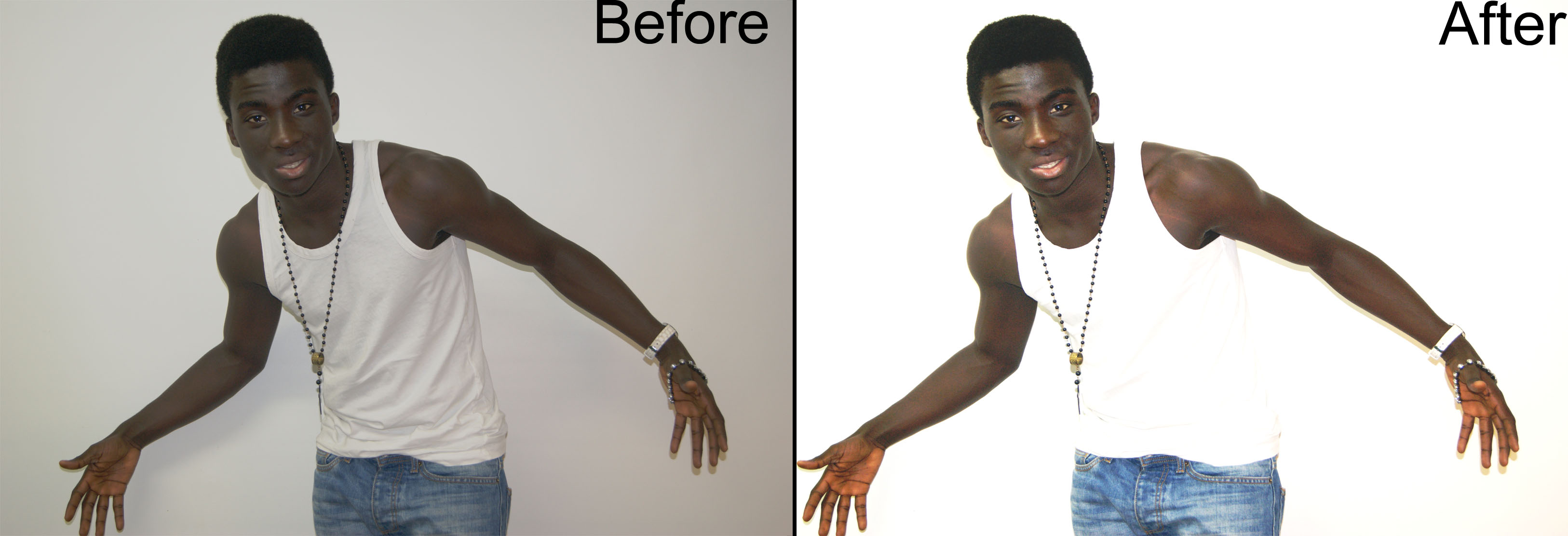
Now that I had created my final pieces, I wanted to get feedback on all three of them. With the feedback I would recieve this would help know what I needed to change on my final pieces. As I wanted my final pieces to be the best they could be I put them onto facebook where I would recieve some comments on what people liked and also disliked.
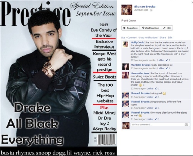
Front Cover:
facebook feedback
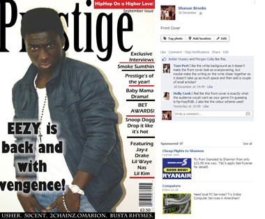
When it came to the front cover people said they like that my background was in white as it did not make the front cover look too overpowering. However some said that I should porbably consider making the writing on the right closer together so it would make more space on the page and would then the page would not be so busy. My target audience which where on facebook genrally liked the front cover, they thought it fit the criteria of what a Hip-Hop and RnB magazine should be like. They liked the colour scheme as they thought those 3 colours best fit th genre. They also said the overall conventions and layout choices used were really effective as it was easy to read and enjoy the page, unlike most magazines which the pages are filled up to much.
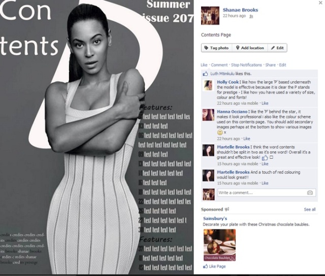
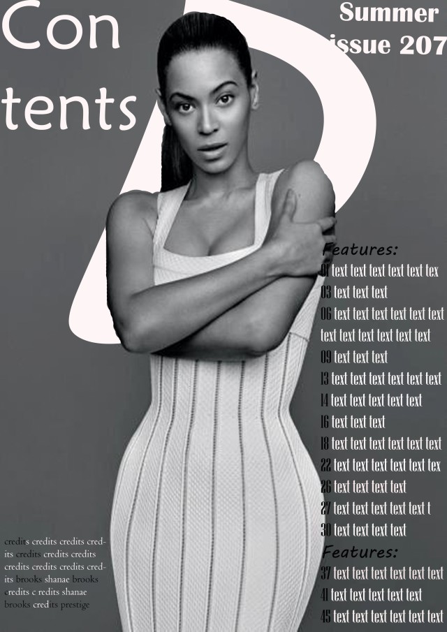
Contents Page:
sdfg
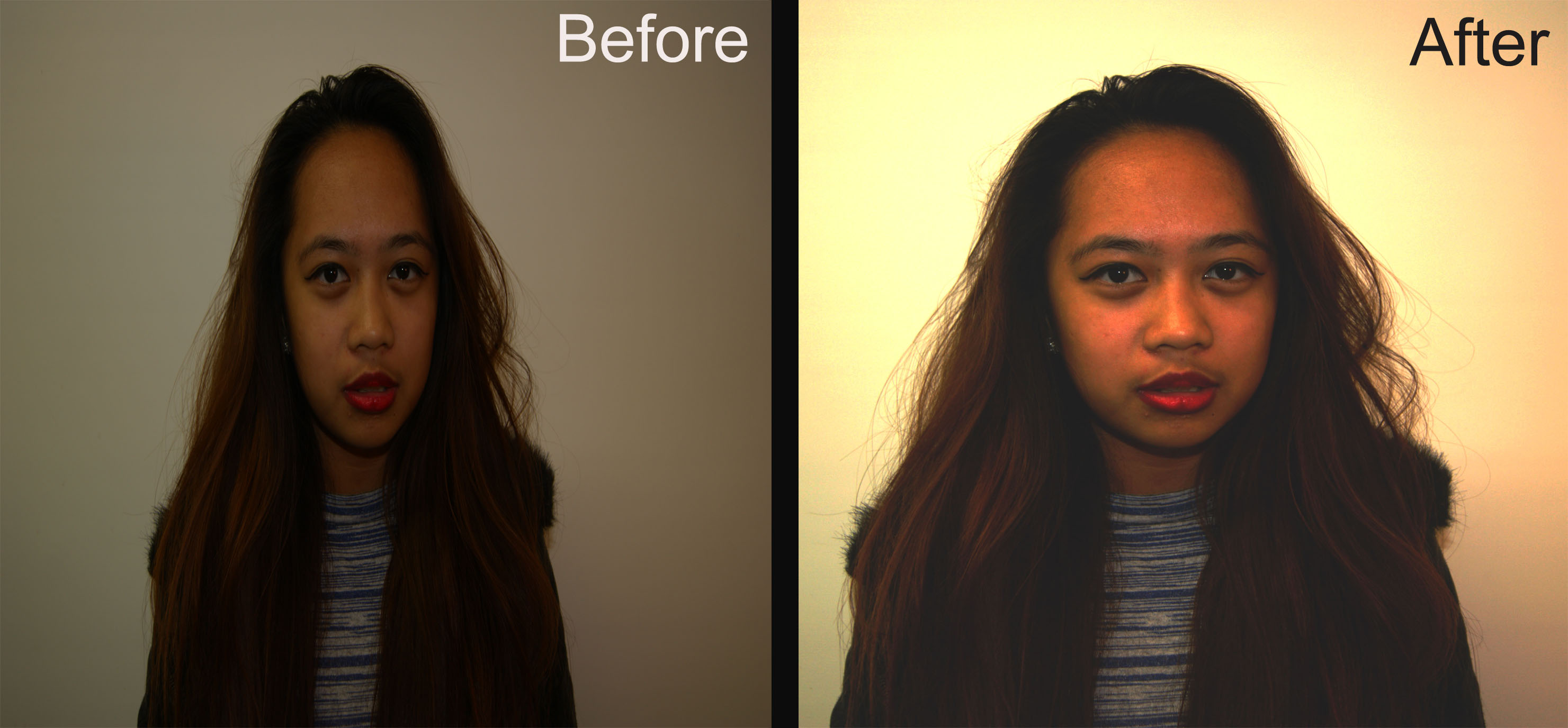
When it came to my contents page people said that the overal picture used was very professional and fit the page perfectly; the lighting in the background being dim really made the cover moel stand out. They also like how I had kept continuity when it came to colour scheme as it fit the genre perfectly and made all the final pieces fit well together. Someone said that they thought tbe pictures in the top right may have been a bit too small, therefore I should perhaps make them a bit bigger. Everyone like the use of the ‘P’ in the background, they thought that it gave the magazine its own brand identity , they also said that the covr model fit well with the genre and was portrayed in the stereotypical way that woman were represented as on Hip-Hop & RnB magazines.
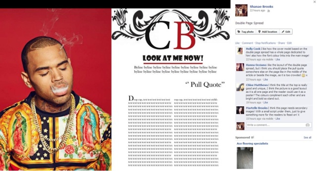
Double Page Spread:
ioy
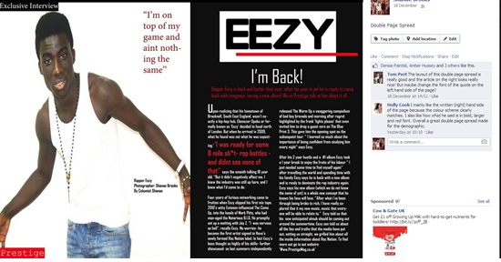
Finally, when it came to my double page spread my target audience did not have much criticism to say about it. They said the colour scheme again fit really well with the magazine, they said overall the page was really effctive looking and had all the conventions it should have. However one thing they believed should be changed was the article on the write. They said that I should change the font of it as the font did not fit very well with the rest of the two pages.

Now that I have all feedback I will take it all into consideration when I make slight changes to my drafts. However before I do that I am going to recieve more feedback from my media class, once I have their feeback I will begin to take my final pieces further and hopefull end up will some great finished pieces.

Prestige’s Front Cover Official and Potential Photos

The first step to creating my magazines final pieces was creating a shoot to which I will receive images that will help me create my magazine. Therefore, I decided how I wanted my shoot to be done; I wanted to create photos that fitted my magazines genre greatly. After doing so much research on magazines pages that are of the same genre as my magazine it allowed me to create images that i believed would fit in with my magazine and help me create meaning when it came to making the final drafts for my front cover, contents page and double page spread.
Once I had taken my images for my magazine I chose only a few to take further and edit in ways which I thought would make the images better for the magazine. I only chose a few as I had taken so many photos therefore I picked my top 3 for each page that I would be making in my magazine.

before and after 3

I decided to choose this as a 2nd possible image that I could use for my front cover that I would edit. I chose this image as I believed the pose and orientation of the photo would fit perfectly to if I was to create a front cover out of it. I believed the pose was fun and would fit well with my magazine as it could even possibly challenge certain stereotypes within the Hip-Hop genre however it could reinforce others. Therefore I again wanted to edit the photo simply therefore when opening it onto Photoshop I simply changed the brightness of the image as this then made the background purely white which then made the image more professional and the colouring much better and it not only affected the background but it too emphasised on the cover model making the image much more interesting and pop more too. Once I had finished making a few slight changes to the image I decided I really liked this photo and its outcome , however I a not sure if this photo would look best as a front cover image or a double page spread and maybe even a contents page image as I believe this photo would look great as either.

before and after 2

Overall when it came to my front cover I wanted my images to be a white background, I wanted to keep the images for my front cover simple therefore with this image I simply brightened the image, this then emphasised on the image and I knew if I was to use this image it would look much better being brighter when it came to adding all the conventions of a magazine onto the image. However even though I do like this image very much I believe it is not presenting the right image that a Hip-Hop/RnB magazine as the cover model stance and mode of address is not the stereotyped hostile way.

before and after 1

I decided to take this photo further and to edit it as I believed the cover models stance and vibe in the photo would fit the front cover perfectly. As in the photo he is giving a hostile mode of address which majority of Hip-Hop magazines do, he is also showing off his jewellery in the photos (which is what I had intended) which may then reinforce a certain lifestyle to the readers alike most Hip-Hop magazines. Therefore, to take this photo further I kept it simple, firstly I made the image brighter as this would make the background completely white, as the original photo did not look as professional with a grey background. Once I had changed the brightness I also changed the contrast of the image to make it brighter and more appealing as it emphasised on every aspect of the image it would then make the image look good once I decided to add the conventions and text that would need to be applied. Lastly I changed the exposure of the image as it again created a more professional vibe to the image. I liked the finished result of my image as I believe it would look great as the front cover image as it fits perfectly with the genre of my magazine and most definitely creates meaning.

Prestige’s Contents Page Official and Potential images

before and after 2

I edited this image as I really liked this one however I was not sure if I preferred it as a contents page image or a double page spread image. Therefore I decided to just take the photo further anyway, by doing this I started of by cropping the image as there was a lot of unneeded space in the photo. I then decided to make the photo brighter as the before image looked boring and rather bland therefore by making it to what I thought would be better I began by changing the brightness and contrast as it made the image more appealing and gave it much more depth. I then decided to change the exposure and offset on the image as it gave the photo an almost white sheen over the image. I was happy with this image, if I was too end up using the image and believed the image needed a slight change then I would do so.

before and after

This being another one of the images from my shoot, this was the final image which I chose to take further as I thought it too would look great on the front cover. My models pose outfit all fits with the genre of magazine and I had her dressed a posed the way she is as it would present the male gaze theory that most Hip-Hop magazines address when portraying a female being featured within the magazine. Therefore I did the simple changes to the image that I had done with my other images I had taken further as for all the images I was taking further I did not want to change the photos too much and make them not relatable with the magazine therefore when editing them I as usual changed the brightness, contrast and exposure of the images as it made them more professional which would make them look much better when adding them to my magazine pages.

before and after 3

I really liked this image as I believed it was very much like my contents draft that I had created. The photo itself fits the genre of my magazine and the mode of address my cover model is giving is amazing we could say that that it is applying the male gaze theory. Therefore when editing this photo I opened it onto Photoshop, I wanted to enhance the photo therefore I firstly as usual changed the brightness of the image, this made the background more white and by doing this not only did it make the background better it emphasised on the cover model as well and that too made the image look more professional which would then make a amazing contents page as when adding the conventions and text it would then make the official page look great.

Prestige’s Double Page Spread Official and Potential Images

I made a few different edits which could be the photos in which I use for my double page spread. When editing these photo I simply made a few changes to each which consisted of changing the brightness, contrast and exposure, I used these as the most important part when editing an image for a magazine is ensuring that the lighting is perfect, as the lighting is what makes the photos look professional and help emphasise on the cover model and what the magazine page it trying to show. Therefore when changing these few things to the images I believe I have done all these things, therefore when I finally create my final pieces it will make them look that much better.

Untitled-1before and sfter 2before and after

More Feedback!

I took my drafts into class as I wanted more feedback as it would allow me to be certain how to create my final pieces therefore I wanted to explore all aspects of different feedback.

Front Cover
IMG_2613

For my front cover draft my peers said I should fill the gaps up on the page they said I should make sure my masthead stretched out across the page and if I was to bring the masthead down a bit i could then add a skyline where I would then add the issues name etc. They said I should make the fonts the same and not having different font types as it looked messy. They also said that when it came to my masthead I should make sure the writing stretched out to fit in the whole box and to also maybe add some red text as well not just white as I needed to use more red text on the page as it was mostly black white and grey. They gave me more constructive criticism on little things I could change to make the page better therefore I will take this also into consideration to then be able to make a really good front cover.

Contents Page
IMG_2614

When it came to m contents page, they all originally liked the layout choices of the page however they said I should try and possibly add some secondary images if it looked good on the page and to also add some red on the page to keep the continuity up within the whole magazine. Other than that they were very happy with the outcome of the contents page.

Double Page Spread.
IMG_2615

With my double page spread they said they liked the use of titles and byline and the layout of the page however they believed that adding some secondary images would make the double page spread more appealing. They also said that I should move the pull quote and possibly place it inbetween the article that would then make more room for text. They also said that on the page with the full image I should possibly add another pull quote to make the page more interesting.

With all this feedback it will allow me to create my final pieces which my demographic will love. I will take all this feedback into consideration when creating my final pieces.

Front Cover Draft Facebook Feedback.

Front Cover Draft Facebook Feedback.

I wanted feedback on my front cover therefore I uploaded it onto Facebook as the people I have on my Facebook fit my target audience.
Therefore, most people said they liked the page, for instance they liked how the main cover line was bold and linked with the image used. They said they liked the layout choices of how all the cover lines were located on the right of the page, it made it neater and look so much better than having cover lines all over the page. They liked the variety of font sizes as it told them almost what was the top story or more interesting then other text.
However some said that they believed that there should not be too many different fonts used.
Therefore now I have my feedback I am going to take the suggestions into consideration when creating my final pieces.

Contents Page Facebook Feedback

Contents Page Facebook Feedback

I posted my contents page onto Facebook as the people I have in Facebook fit my target audience greatly therefore I wanted their feedback on the contents page and how I can make it better and what they liked about it.
Most of the people that commented said they like the use of the ‘P’ on the page as it then related to the name of the magazine and they thought it created a brand identity and made the page go really well together. They like my use of different font sizes and the layout of the page as it was easy to read and organised.
My target audience genuinely loved the page however they thought by adding some red to the page it would then create continuity to the rest of the magazine by applying the same colour scheme throughout.
Therefore when creating my official contents page I will make these changes and apply them.

Double Page Spread Facebook Feedback

Double Page Spread Facebook Feedback

I posted my double page spread draft onto Facebook to get feedback from different people on what they thought of them. I asked them to give me criticism on what they like and what I could improve or add to make it better.
For starters some people said they believed the page would be better with some secondary images and it would make the page more interesting as when they read a magazine they like to have loads of images to look at. Others said they like the idea of having one side of the double page spread being a full image as they could then use it as a poster if they wished too. They said they liked the layout and the colour scheme as it kept continuity with the front cover. Lastly some said that they believed the pull quote should be located somewhere else possibly in the middle of the article.
Therefore I believe I got really good constructive criticism and I will use these ideas and tips when creating my official double page spread. The feedback has helped me a lot.

Prestige Magazine Front Cover Draft and Analysis

Prestige Magazine Front Cover Draft and Analysis

This is my first draft for my magazine, here is the front cover that i designed which is what my official front cover for my magazine may potentially look like. After receiving my questionnaires back and holding my focus groups I created my drafts in the designs they preferred and included the artists which they too preferred.

I believe I have created potential meaning in my front cover, for instance I have made my cover model a star who my target audience favoured, my cover model is dressed in all black, which can connote, power and wealth, which then enforces a certain lifestyle to my demographic. Just like many other magazines of this genre, my cover model is giving direct mode of address and a possible hostile mode of address as well, this then implies the dominant stereotypical representation of artists from this genre, of them being quite angry and hostile people.

My front cover draft has very little conventions as that is what my target audience said they preferred, my magazines layout choices is too a result of my focus groups preferences. The front cover has a main cover line, which links with the cover image, by using anchorage it allows my demographic to get some information on what is going to be inside the magazine. The front cover of my magazine will/does mostly presents cover lines on what will be introduced inside the magazine. Therefore on the right side of the front cover is a list or blocks of cover lines, this is organised and makes the page less busy which is what my demographic wanted their front cover to be like. The magazine too has at the top of the page what issue this magazine it is, this allows the audience to know what issue it is and not accidently buy the wrong issue, it too can be seen as allowing the audience to collect the issues if they wished. The magazine lastly has a masthead, however it is at the bottom of the page as my target audience said they preferred it this way, the masthead, involves more information about what will be included in the inside of the magazine. Lastly the magazine title will always be at the top left of the page, by allowing the writing to be behind the main image, it shows the this star is a very famous one, and as the magazine grows the audience will not need to see all of the title to know what magazine it is.

Lastly the colour scheme of the magazine is black, white, red, and grey, this colour scheme is the usual colour scheme you would see on a Hip Hop magazine as the colour are neutral, to male and female and also these colours can connote, wealth, fame and power and many other topics that we could associate with the Hip Hop and RnB genre.

Contents Page Draft and Analysis

Contents Page Draft and Analysis

When creating a draft for what my contents page may potentially look like, I took into consideration what my focus groups and questionnaires had said they preferred to be included in the magazine and how they wanted the layout to be.

The leading image was to be the main focal point of the magazine as my focus group all agreed that they did not like a contents page that was overpowered by writing all over the page, making the page to busy and confusing to read. My leading image was of a woman, this enforces the male gaze theory and possibly even the female gaze theory as woman may wish to be like Beyonce, therefore by having her on the contents page this then uses star appeal making the demographic wish the read on.

The magazine has again simple conventions used on the page. The title of the page ‘contents’ is located at the top left of the page, where on the top right of the page is the issue and edition, at the bottom left of the page, is information giving credit to the creators of the page and the photographers too. The features and information telling the demographic which page is what, is in a simple structure on the right of the page, by it all being together it is simple for the demographic to read as it is not located all over the page. The features information is too located write next to the leading image as it makes the demographic find it easier and by the leading image draining the demographic in they will then read the information next to it. For this contents page to colour scheme is not really important as, there will b no specific colour scheme for the magazine as the leading image may always be different, however with the greyscale look it too can possibly connote the simplicity of the page and wealth.

With the contents page being laid out in this specific way, it gives the magazine a brand identity as these layout choices and conventions used will always be used for the magazine, it can make the target audience get somewhat comfortable with the magazine as they are used to the layout choices.