Analysis
Now I have finished my school magazine ‘The Next Step’ I believe I have produced a piece of material that fits my chosen target audience. I believe I have made an exceptional front cover and contents as the target audience for my magazine are the ages of 11-12, my magazine is based on year 7’s coming up and dealing with the big change of going from being in primary school to coming up in secondary school and being bottom of the food chain. The magazine tells them everything they need to know about ‘surviving’ year 7, what to expect and tells them everything they need to know.
As my target audience will be very young I have made the cover and contents very basic when it comes to language, I kept the language very colloquial as if there was a lot of language and higher level vocabulary my chosen target audience may find it hard to understand and hard to relate to the magazine. I have also used on the front cover short fun phrases like interrogatives and imperatives like ‘scared of getting lost’ as this will intrigue the target audience and make them want to read on. By using all this with the language I believe it helps relate to my chosen demographic more as its easy to read and all the flash buttons and taglines are things that they can relate to.
Therefore, as my chosen demographic will be the ages of 11 and 12 who are going into secondary school I had chosen my cover model to be around the same age too wearing the school uniform, this too will make the demographic relate to the magazine as it will straight away show them that the magazine is for them. My chosen background was bricks as I believe in some way it could connote graffiti (which my writing on the magazine looks like) which too connotes with a rather young aged demographic . Therefore I believe I have achieved producing appropriate material for my chosen target audience.
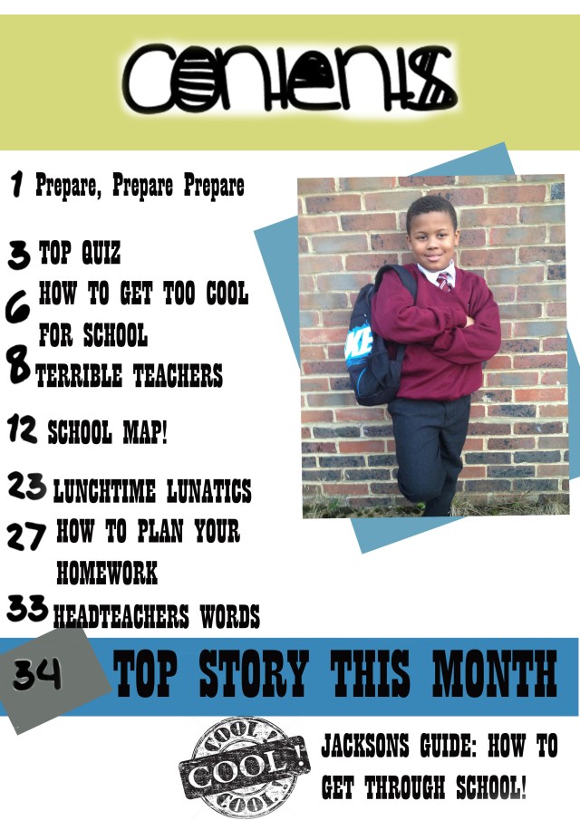
Furthermore, I made sure my magazine fit all the conventions that a magazine should have. I started by adding the basics a magazine should have but to some extent putting my own twist on some of them. I used and footer to give extra information’s about the magazine to the demographic and what they can possibly get inside. I have used flash buttons and subtitles and taglines within the front cover of the magazine but I have done them in a theme which fits in with the bricks –graffiti looking- therefore it looks cool and is again relatable to the demographic, I have use the flash buttons to tell the target audience the price (free) and articles that are within the magazine. I’ve used anchorage as well to link the photos with the text, this will show what is going on inside the magazine and tells the audience that there is a link to the cover model (they’re not just there to look nice). Lastly I have used secondary images to also give the target audience an inside of what is inside, this all may want them too read the magazine more.
More so, I believe I have showed ability to use ICT appropriately as I gave managed to use the appropriate pictures for the task as they fit the demographic I wanted to show. Juxtaposed to this I do believe you may not picture this magazine in a local shop or store as a usual magazine would have a basic background not one of scenery, however I could very much imagine this magazine in a school as it is fun and not so serious and boring. Furthermore, I believe I have shown the ability to use ICT as my magazine cover and contents were created on Photoshop and show all the conventions and layout that a magazine should and would have. I have been able to resize and crop photos that needed to be and I have shown how different text need to be different sizes as it makes certain articles stand out showing the importance and making them all stand out in a certain way making the magazine more interesting to read and easier to focus on different aspects. I have too used neutral colours in my magazine to show that this magazine’s target audience is too boys and girls.
I would give my work a level 3 as I have said in the following paragraphs I believe I have shown strong ability to produce material appropriate for my target audience as my work fits the demographic I intend to have. I believe I have shown great knowledge of understanding the conventions and layout of a magazine. I’ve shown good awareness for the need of having different sized text and different fonts as it is important. I have been able to manipulate my photos appropriately for the context of my presentation and I believe I have shown great ICT skills and have shown how to use it appropriately for my task.
I think the most successful thing to my magazine is the layout and conventions of the magazine as everything fits really well on the page together; nothing is in the way of anything else which means you can focus on the entire magazine without getting confused by there being too much on the page. I have used anchorage and added flash buttons, tag lines, skylines and even footers and I think it helps the magazine to look like a real magazine that you would buy. I like how by adding secondary images to the magazine this gives the reader an inside view of the magazine inside. I think the simplicity of colours used on the front cover and contents of my magazine too make them successful as for instance as my front cover has a cover photo with not a simple block colour, I have used just black and white for my writing as it fits better with the cover photo and doesn’t make the magazine have too many different colours making the front cover seem over powered with too much. Also within my contents the colours are very neutral and simple therefore it shows that the magazine is for boys and girls and by the colouring being very simple, it makes the contents simple to read and not having too much on the page making it confusing for the demographic to read.
However to improve my magazine front cover I do think I could have possibly made my cover photo a bit more ‘tidier’ as there is somewhat too much going on –how near the bottom of the photo you can see weeds and grass- it is not very nice and you would not get this on a official magazine, therefore to make it better I should have made sure the background was fully just the brick wall and nothing else could enter the photo. Also for my contents page I think I could have had possibly made the writing a better sizing as there is a lot of space in between lines of writing therefore i could have sized it better or have added more articles within the contents page.
Now having finished my school magazine front cover and contents page it has taught me that for when I create my final product I should look carefully and plan better my images for the magazine to make sure they look like official pictures that would be in the usual magazine and will look tidy and look like a high quality picture. It has also taught me to even if I wish to make my contents simple and not too much going on, I still have to fill all the space and make sure the sizing and font look well done and tidy.