Rolling Stones Front Cover Analysis

Rolling Stones Front Cover Analysis

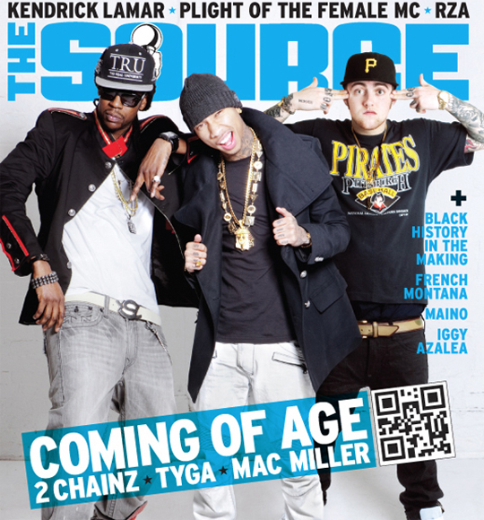
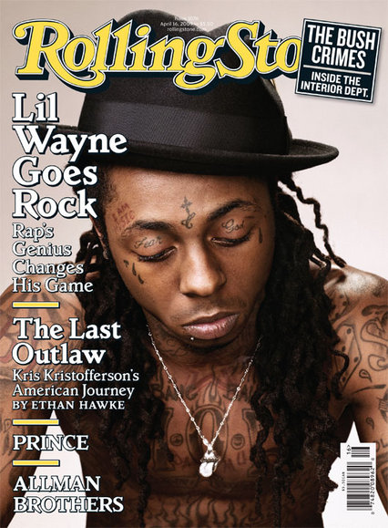
Rolling Stones magazine is a rock magazine; however they do introduce artists from different genres of music e.g. Rihanna and Lil Wayne have been on the covers of Rolling Stones magazine. More so, when a different genre artist is on a magazine that does not fit their typical genre, the magazine portrays them in a way that fits well with their magazines genre. For example on a magazine like Vibe Lil Wayne would be portrayed in quite a thug way with lots of gold jewellery and giving quite a hostile mode of address as that is how Hip-Hop artists are stereotyped.
However on this cover they challenge the dominant ideologies of rappers, as Lil Wayne is portrayed and shoes the dominant ideology of a rock star which is -tattoos, topless, the typical styled hat- which they have portrayed Lil Wayne in that way. This appeals to the audience as the usual target audience will be interested in the change over of having a rap artist on a rock magazine. Furthermore, on a typical Hip-Hop magazine, the cover model gives quite a hostile direct mode of address, looking straight at the audience as if they are talking to them. Whereas on this front cover they have used indirect mode of address to portray Lil Wayne in a somewhat sensitive thoughtful way like he has maybe a plan or is in deep thinking, this appeals to the audience as it will give them suspense, wondering why Lil Wayne is on the front cover and what the article is about. They have used anchorage as in the cover line they explain why Lil Wayne is looking this way ‘Lil Wayne Goes Rock, Rap Genius Changes His Game’ this explains to the audience that Lil Wayne is crossing genres and why he is on the cover of a Rolling Stones magazine this will appeal to the audience and also not the usual target audience as Rolling Stones are showing that different genres can cross over and challenging ideologies and stereotypes of people.
As Lil Wayne is not the average person to be shown on a Rolling Stone front cover as he does not fit in with the genre, they have allowed they magazine name/title go over the cover photo, they do this as even though Lil Wayne is very famous and well known he may not be as known in the rock world and genre. Also if they were to put the cover photo in front of the magazines name, the audience may get confused as to why a Hip Hop artist is more important then the name of the magazine, as they are to different genres on one page. However they use a flash button to cover the name of the magazine, this shows that the magazine is still well known as the audience will known that it is Rolling Stones without having to show all the letter of their name. By having the same font for the name of the magazine this creates a brand identity, as this type of font used with any word, the audience would automatically link it to Rolling Stone magazine.
The magazine uses a simple layout and does not use very many conventions and techniques that we would see on a typical magazine cover it has a flash button which shows a important article that is inside the magazine. The front cover then shows the usual list of cover lines showing the audience what they will expect to see inside the magazine. This will appeal to the audience as the cover is simple yet appealing as it shows them what is included in the issue, without overpowering and filling the cover up. Rolling Stones uses simple colours which contrast well together –yellow, white and black, these colours fit well with the cover photo as the do not take the focus of the cover photo and cover lines as they are very neutral colours. Rolling Stones magazine does not stick to the same colour scheme every issue.

The Source Magazine Front Cover Analysis

The Source Magazine Front Cover Analysis

Source magazine is a Hip-Hop magazine created in America. The magazines target demographic is between the ages of 17-25, their ideal audience would be urban out lookers, who are interested in the hip-hop game and probably for those who are working class. When we look at their magazine name ‘the source’ we think what that could mean or what are they trying to tell us within that choice of name. When we look up the word ‘source’ in the dictionary it states it means ‘ A place, person or thing from which something comes or can be obtained’ also ‘Obtain from a particular ‘each type of coffee is sourced from one country’’ therefore we can suggest that when they came up with this name for the magazine they are trying to tell the demographic that their magazine is where the audience can get all the information they will need, and that everything The Source magazine tells us is legit and we can suggest that they believe they are the top magazine who has all the latest information.
By the way the magazine has placed the cover models in front of the title ‘The Source’ this shows us that the cover models are famous and important to the magazine as they are allowing them to cover the title. This also shows that the magazine is a well known magazine as we do not need to see the title of the magazine to know what this magazine is. Usually on a magazine cover we are used to their only being one artist on the cover unless the cover models are a group or band and not 3 separate artists. However we learn why they have done this in the tagline ‘Coming of Age 2Chainz Tyga Mac Miller’, the magazine uses anchorage to show how there is a new age of music that is coming in the Hip-Hop industry. I believe by this tagline The Source magazine is not only saying ‘coming of age’ as they are new artists in the industry but too that, the dominant ideology of Rap music is that artists are black, however they have a white artist on the front cover which shows they are challenging dominant ideologies and showing how ‘coming of Age’ could also show how you do not need a certain skin colour to be apart of a certain genre of music. This will appeal to the audience as it is something new to them and they will want to read more, this also shows the target audience that this magazine is for more types of people then stereotyped.
Furthermore, The Source magazine again challenges the dominant ideology that Hip-Hop artists are angry and quite hostile as one of the artists on the cover look pleasant and not the typical angry and unpleasant selves. However they do reinforce the usual ideology that rappers have lots of tattoos and live a pimped life style as such as they wear lots of chains and gold jewellery. This shows the audience that there is a ‘coming of age’ as some things are different however the usual ideologies and stereotypes will always stay the same.
Henceforward, the magazine uses the usual layout techniques of placing their cover lines around the cover photo. However they do not really use many conventions that a typical magazine would have, they simply have a skyline which introduces us to some of the celebrities that will be in the issue, they have their main story line which links in with the cover photo and lastly they have simple cover lines which tell us the names of people that will be introduced in the magazine. I believe this is quite affective as it is a music magazine people are more interested in the artists who will be involved in the issue, therefore by just simply telling the audience who will be in the issue, this will appeal to very many people as they will see an artists who they may like and then want to know what the article on them is about, it creates suspense to the reader. Also by keeping the front cover simple it does not over power the front cover making it confusing to the audience.

XXL Magazine Front Cover Analysis

XXL Magazine Front Cover Analysis

XXL magazine is a Hip-Hop magazine. Its target audience is an age range of 17-25 years old; their typical buyer would be someone urban, who is interested in the Hip-Hop lifestyle (music, smoking, and possibly interested in the lifestyle that these type of people live).We do not fully know why the creators of this magazine have called it XXL magazine but we can only guess. When we look at XXL magazine covers the title is always in the same font and colour. We can suggest that they do this as they are somewhat creating a brand, therefore when anyone see’s the title in the same colours they will automatically think of XXL magazine. XXL traditionally stands for extra extra large, therefore the creators of XXL magazine could have chosen this name as they are basically saying their magazine is going to be massive in the terms of how well it is doing, also they could be telling us how everything about it i.e. articles and the celebrities shown inside it will always be big and the magazine will always be big (the best, most popular etc.).
Furthermore, we can tell the cover model is famous as they have allowed the cover model to cover their title (you can not see all of the title), therefore this shows that they are famous and really want to show him off the audience as they will appeal to him as he is high up and they ma be a fan of his. By also covering their title with the cover models photo, this too shows how the magazine is well known as the audience do not need to see the whole magazine name to know that it is XXL magazine.
Henceforward, they use a camera angle of a close up on ‘the game’ to really emphasise on his expression and pose. They use anchorage as they show him putting his hands to his head in the sign of guns which show him possibly shooting himself in the head. We then look at the tagline towards it and it states ‘self destruction’, which fits in with the pose he is doing, this somewhat appeals to the audience as they want to now read the article to understand why ‘the game’ is destructing himself. XXL magazine enforce the ideology to the audience that Hip-Hop artists are thugs, with guns, killing and tattoo’s, hence why they have had the game topless to show off all his tattoos. They too have used a direct mode of address but made him look quite hostile and not pleasant, this too enforces the ideology that Hip-Hop artists are unpleasant and angry people and that the music genre is too quite angry and hostile revolved around guns and crime. This will too appeal to the audience as they are into this genre of music therefore it makes more sense to portray the cover model in that way instead of portraying him in a way that does not fit in with the genre stereotypes.
They magazine has not used many other cover lines on the front cover and kept them away from the cover models photo as they may would not want to take away focus from the main story, therefore they have kept the other cover lines around the top of the cover. In one cover line they have used slang ‘smoke sumthin’’ to appeal to the audience as the audience will then relate as they use that type of slang and abbreviations as well. XXL magazine uses the same colour scheme of white black and red, all these colours fit in with the genre of the magazine and the theme of this issue, as they all together can connote a blood, destruction, pain and quite and negative vibe. Although XXL magazine has their own brand identity and choices of layout and vibe they wish to give their audience, they still use some of the usual conventions and layout choices that most magazines use like the ones I have stated previously.

Vibe Magazine Front Cover Analysis #2

Vibe Magazine Front Cover Analysis #2

On this front cover by vibe magazine they have used many conventions that are used on many other magazines and have used a similar layout that you see on many of their other magazine covers of theirs.
By them having the cover models photo cover the magazine title –Vibe- this shows how big and famous the cover model is as they are allowing him to cover their name. This also shows how big the magazine is as they do not need to show all the letters in their name for the audience to know it’s them.
The cover model is showing quite a hostile mode of address as he is hiding his eyes therefore not giving a positive look to the audience. The cover models pose plays on with the tagline next to it, they use anchorage as when you first look at the cover models pose, and we first think he is putting his middle finger up at us but when we look closely and read the tagline we see how it says ‘he’s no.1 and married with a vengeance’, we then notice he does not have his middle finger up but his marriage finger which too has a ring on it, this then links the text with the photo. Usually a quite negative hostile pose like this would not bring in an audience, however as the genre of the magazine is hip-hop and RnB which the music in that genre is quite hostile, it then shows in the pose of the cover model therefore the target audience will appeal to this.
The layout applies the usual conventions of a magazine as it has the typical cover model, header and taglines. They use teasers on the magazine ’15 Shocking Celebrity Sex Scandals’ this will give the reader a clue as to the storyline, appealing to them making them want to read and find out. They also use alliteration ‘Sex Survey Staring’ this emphasises on the words making them sound more interesting. Through the use of the word ‘swagger’ this is slang and fits with the genre of the magazine which will too appeal to the audience as they can relate to this type of language.
The magazine uses a range of fonts sizing and colours to show a lot is going on and to differentiate the different topics in the magazine, this appeals to the reader as they can see everything that is going on in the magazine and spot the articles they will enjoy.
With the topics that are brought up in the taglines and the cover photo being hostile, this shows the type of lifestyle that is created and who the target audience are. Someone who is urban, young and is interested in hip-hop music.

Vibe Magazine Front Cover Analysis #1

Vibe Magazine Front Cover Analysis #1

On this issue of Vibe magazine the creators of the front cover have used the usual conventions and typical layout on the front cover to appeal to the potential buyers eyes.
Vibe magazine which features RnB and Hip Hop artists, actors and other entertainers. Their ideal demographic is young urban followers of Hip-Hop culture. The target audience is 18-25 year olds. 75% of the audience were male whilst the other 25% were female. Their ideal readers personality are Fun, sophisticated, sporty and rebellious, therefore you can tell this by the way the present their magazines and the type of articles they introduce. The context on the magazine of the magazine relates to the genre music of the magazine.
Vibe has used the male gaze theory, as they have sexualized their cover model to attract both men and women. Women will be also attracted to the cover model as she is a celebrity that they may love and may wish to be like her. They have camera angled the shot as a medium shot of her as they wish to show off her body and emphasise on the way she looks and how ‘hot’ she is, as they have said in the tagline next to her ‘Hot like Me’, therefore they have used anchorage to link the image and how she looks to the text. She uses direct mode of address to connect with the reader as if the writing or model is speaking to them. They have dressed her in black as it emphasises on the phrase ‘little black dress’ which too fits in with the image they are trying to portray of her and it fits in with the colour scheme of the magazine and does not overpower the colours in the background.
They have used interrogatives (‘don’t you wish your girlfriend was hot like me’) these are formed questions to stimulate and immediate response from the reader and this would appeal to the reader to make them interested in reading the rest of the article. They have also used alliteration ‘New Music New Body No Bow Wow’ as it emphasises the words making them more interesting and this makes it catchy to the reader and not boring. They have even used simple conventions of adding flash buttons to emphasise on something the reader will be interested in making them want to read and find the article.
They have conventionally placed all the taglines around the page in an order that will make it easy for the reader to look at and focus on, they’ve used different sized font to show the reader what articles are not necessarily more important then others but which articles may be the most interesting or are the top stories of the issue. In once tagline they have used different font colours which fit with the music group they are talking about. A Tribe Called Quest which are music artists from the Caribbean, therefore the colour scheme are the Caribbean colours which then relates the context to the colour scheme and appeals to the audience as it gives them a sense of knowledge of what the article is going to be about.
With all these conventions and layout choices they are all done to appeal to the target audience appealing to them in many way therefore they will be able to somewhat relate and then buy the magazine.