This contents page is from XXL magazine which is a Hip Hop magazine.
XXL magazine do not use the usual title for their contents page, the usual title would be the word ‘contents ‘ however on XXL magazine they consistently use the title ‘The A Side’, which is telling the audience this is where they will find out where everything is. By consistently using this title it creates a trademark to the magazine and appeals to the audience as they will feel comfortable with the way the magazine keeps its usual conventions.
XXL magazine always use the same colour code of White Black and Red, this then fits in with the Logo of the magazine on the front cover (XXL being in a red block in white writing), with these colours, it keeps the magazine consistent and not confusing by having to many colours throughout the magazine. It too gives a quite rich and powerful vibe as these colours together are neutral and connote things like darkness blood which are quite tough and fit in with the genre of Hip-Hop and how the artists are portrayed, it would not appeal as well if the colours where for example green or yellow. By having a consistent colour scheme this creates a brands identity as these colours in a magazine will remind the audience of XXL Magazine.
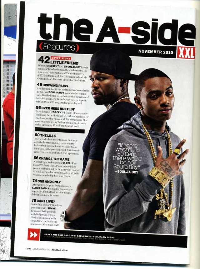
Furthermore, the main image on the contents is the main focus, the image uses anchorage as on top of the image there is a pull quote from an article within the magazine, it explains why the photo is the way it is and why there is more than one person on the contents (who are not in a band or group). By using anchorage and making it a pull quote it appeals to the audience as they now get an inside of what the article is going to be about, which they might find of interest.
Henceforward, the magazine reinforces the ideology of the bad boy thug image of rappers, as they portray the stereotypes within the pose of the 50 Cent and Soulja Boy. By having both rappers in jewellery this reinforces a certain lifestyle to the audience, not necessarily one they have to abide by, but one that fits in with this genre. They also reinforce the stereotypical image of rappers by showing of Soulja Boys tattoo on his hand.
Both rappers display a hostile mode of address to again reinforce the stereotypical rappers image. Their poses are as well quite hostile and threatening, some may even say boss like (for 50 Cent). By portraying these rappers in these ways it appeals to the target audience as this is what they expect to see from a rapper and those of the Hip Hop genre and this is the way they are portrayed therefore they have to abide by these rules to appeal to their target audience.
More so, the magazine uses a similar layout as Vibe magazine (in my previous analysis’) as their writing around the cover model and keep it to one side of the page instead of scattering it around the page, this is appealing to the audience as it is easy to navigate around the page and find what they are looking for. They keep the writing rather small, we can only suggest they do this as they believe pictures are more interesting and speak more words, therefore they want to emphasis and focus on the photo more, as the ideal demographic may prefer pictures and small quotes to a page full of writing, therefore they keep it small and to one side. They use short and snappy headings for each description of the different pages within the magazine. This makes it more interesting to the reader as it will make them want to see what they heading means and then read on or then locate to the page it is on.
Lastly the magazine uses footer on the page to show a short sentence to tell the audience and give credit to the photographer who did the photo shoot with the rappers. They do this to give credit to the photographer as it is only fair, they have the writing small as the audience are not really interested in this information; however XXL magazine still have to put it there.
Therefore, all these layout choices and conventions used appeal to the audience as by having the contents page consistent in all their magazines it creates a brands identity and gets the audience used to the magazine and makes them more familiar with it.
