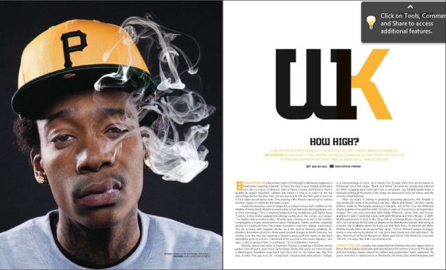
This double page spread is from a Hip Hop Magazine. In this double spread they use one of the pages to promote the artist by making the whole photo be the artist. By doing this it appeals to the audience as they could use this page as a poster if they wanted to. By having the lead image a photo of the artist ‘Wiz Khalifa’ it shows the article is very much about them. They use intertextuality to portray the artist to make him look to the audience how he portrays himself in his music, for example Wiz Khalifa consistently in his music talks about getting high and smoking week, therefore they have made Wiz Khalifa have smoke coming out of his mouth. This appeals to not only the target audience but the artists fan base as the images and article fits with the way Wiz Khalifa is portrayed. This too reinforces the ideology of rappers smoking and taking drugs. Wiz Khalifa shows a hostile direct mode of address, this again reinforces the way a stereotypical rapper is seen, however the artist may not be a hostile person at all. This appeals to the audience as the magazine shows the genre all the way through.
The magazine again uses intertextuality when it comes to the choice of colour code, by choosing the background of the lead image to be black and the artists hat to be yellow as well as the writing and heading fitting this fits in with the artist as Wiz Khalifa’s #1 song is called Black & Yellow and it is what he is known for. Therefore this appeals to his fan base as it links his work in with the article and makes it more interesting and fun in some ways for the audience.
Henceforward, the magazine keeps the title very simple, they use Wiz Khalifa’s trademark initials using the colour code of black and yellow again to indicate his song Black & Yellow and to promote Wiz Khalifa not only as an artist but as a brand also. The magazine uses a heading of ‘How High’ by using alliteration this intrigues the audience and it also interests them as the questions is based around the artists personality of how he is portrayed, therefore it reinforces the rapper lifestyle which appeals to the audience. The use of a steadfast tells the audience a bit about the artist the article, this appeals to the reader as they learn if the article is going to be interesting to them without having to read the whole article. Furthermore, they use other typical conventions like a by line which gives credit to the photographer and writer of the article, it is in small writing as to the reader it most likely will not interest them however they still have to give credit to those who created the article. Lastly the magazine used a drop cap at the beginning of an article and use the layout of columns as these two conventions are the typical way to have your text in your magazine also by having columns it is neater and looks better on the page instead of having a normal paragraph layout.
All these conventions and use of layout on a double page spread appeals to the reader as these conventions and layout choices are normal to them as most magazines do the same. The audience are interested as a star is introduced on the article and they learn a lot of information.
