Magazines Double Page Spread Analysis

Magazines Double Page Spread Analysis

This double page spread is from a Hip Hop genre magazine. The magazine uses the same layout of having the lead image using a whole page of the double page spread, which is again located on the left hand side. This magazine the artist Soulja Boy does not used direct mode of address they possibly do this to emphasise on the writing on his face and to show his tattoos, by showing of his tattoos this reinforces the ideology of rappers being covered in tattoos. These leading images challenges the ideology and stereotype of how rappers are hostile and always look rather angry, they may have done this as it then fits in with the article itself, of Soulja Boy almost celebrating and boasting about his current lifestyle and how well he is doing in his career. This will appeal to the audience as it does not fit in with the usual stereotypes of rappers being angry.
The pages title uses graffiti font which fits in with the style and genre of the magazine, as graffiti can connote the streets and ghetto the colour choices of red and black too show this as the may represent blood and darkness. The double page spreads uses the usual conventions of a steadfast, this appeals to the reader as it gives them some information about Soulja Boy and about the article which they can find out before reading the article. The page too uses a by line which gives credit to the photographers and writers of the article, it is always small as the audience may not be really interested in this information however the magazine still has to give credit to them. They also use a drop cap and columns as most magazine use these conventions therefore they are seen as the normal and comfortable thing to have for readers.
All these choices of conventions and layout is what appeals to the reader and entices them to read the article.

The Source Magazine Double Page Spread Analysis

The Source Magazine Double Page Spread Analysis

This double page spread is from the magazine The Source which is a Hip Hop magazine. The lead image on this spread is of two artists, Soulja Boy and 50 cent. From the poses and hostile mode of address giving from the artists reinforce the stereotypical view on rappers of how they are angry and thug like; this will appeal to the audience as this is how they view these artists. They do this too with the way the artists have a lot of jewellery reinforcing the rich lifestyle and stereotype of how rappers are flash with all their big chains of jewellery. They use anchorage as they link the text with the lead image; 50 Cent saying he is the almost guardian of Soulja boy, therefore he stands in the background of the image in a protective stance, which Soulja Boy shows quite a cocky stance, this again appeals to the audience as it fits in with the context and as the was the front cover story, it fits in well with it and stays consistent with the front cover.
The double page spread uses the typical conventions and layout choices as many double page spreads from other magazine. The lead image always uses up a page and that page is always the one on the left hand side. The magazine uses a pull out quote as the title, as the pull out quote is very explicit this creates suspense to the reader as it will definitely make them want to read on. Most magazine would not use swear words within promoting an articles title however as this is a Hip Hop magazine they will promote it as it fits the genre very much, this then appeals to the audience as the magazine does not hold back.
This double page spread is very basic as it does not have a steadfast, by line or drop cap which most magazine do include in their double page spreads. The magazine uses the usual layout choice of placing their text in columns, this makes the page easier to read as it is neater and this is the typical way to layout the writing on a double page spread.
All these conventions are what draws the audience in and these devices makes the reader actually read the column.

Double Page Spread Analysis

Double Page Spread Analysis

This double page spread is from a Hip Hop Magazine. In this double spread they use one of the pages to promote the artist by making the whole photo be the artist. By doing this it appeals to the audience as they could use this page as a poster if they wanted to. By having the lead image a photo of the artist ‘Wiz Khalifa’ it shows the article is very much about them. They use intertextuality to portray the artist to make him look to the audience how he portrays himself in his music, for example Wiz Khalifa consistently in his music talks about getting high and smoking week, therefore they have made Wiz Khalifa have smoke coming out of his mouth. This appeals to not only the target audience but the artists fan base as the images and article fits with the way Wiz Khalifa is portrayed. This too reinforces the ideology of rappers smoking and taking drugs. Wiz Khalifa shows a hostile direct mode of address, this again reinforces the way a stereotypical rapper is seen, however the artist may not be a hostile person at all. This appeals to the audience as the magazine shows the genre all the way through.
The magazine again uses intertextuality when it comes to the choice of colour code, by choosing the background of the lead image to be black and the artists hat to be yellow as well as the writing and heading fitting this fits in with the artist as Wiz Khalifa’s #1 song is called Black & Yellow and it is what he is known for. Therefore this appeals to his fan base as it links his work in with the article and makes it more interesting and fun in some ways for the audience.
Henceforward, the magazine keeps the title very simple, they use Wiz Khalifa’s trademark initials using the colour code of black and yellow again to indicate his song Black & Yellow and to promote Wiz Khalifa not only as an artist but as a brand also. The magazine uses a heading of ‘How High’ by using alliteration this intrigues the audience and it also interests them as the questions is based around the artists personality of how he is portrayed, therefore it reinforces the rapper lifestyle which appeals to the audience. The use of a steadfast tells the audience a bit about the artist the article, this appeals to the reader as they learn if the article is going to be interesting to them without having to read the whole article. Furthermore, they use other typical conventions like a by line which gives credit to the photographer and writer of the article, it is in small writing as to the reader it most likely will not interest them however they still have to give credit to those who created the article. Lastly the magazine used a drop cap at the beginning of an article and use the layout of columns as these two conventions are the typical way to have your text in your magazine also by having columns it is neater and looks better on the page instead of having a normal paragraph layout.
All these conventions and use of layout on a double page spread appeals to the reader as these conventions and layout choices are normal to them as most magazines do the same. The audience are interested as a star is introduced on the article and they learn a lot of information.

Source Magazine Contents Analysis

scan-23-e1359373778724

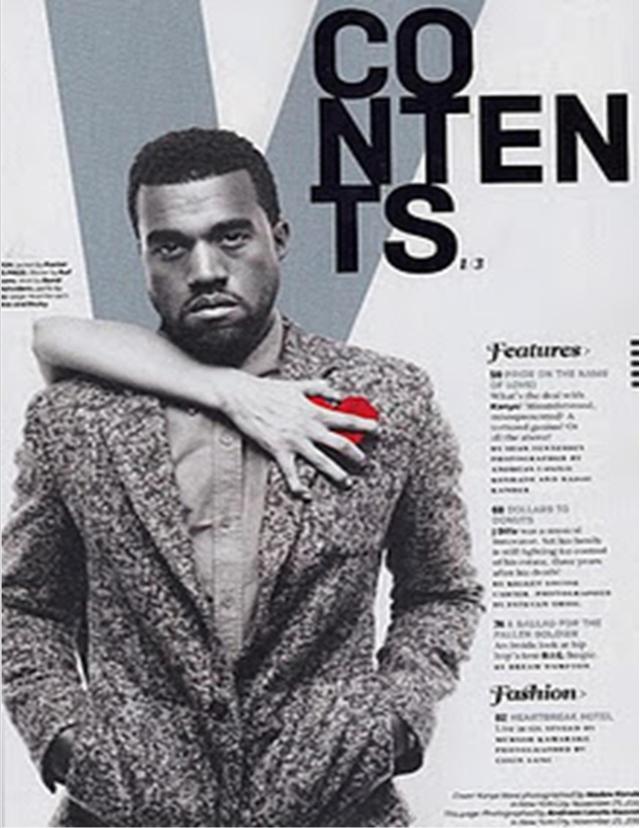
This is a contents page from the magazine The Source, which is a Hip Hop magazine.
Source magazine keep their contents page rather simple, which I believe looks better than there being too much on the page. Source magazine always use very dull colours on their contents pages. Usually using black and red, these colours are usually featured on Hip-Hop genre magazines as to colours can represent a tough and expensive feel, which is what we think of when we think of rappers and hip hop music.

Source magazine consistently uses the title ‘Master Plan’ we can suggest they do this as by having the same title it creates a trade mark to the magazine, therefore if the target audience here the phrase ‘Master Plan’ they will automatically think of Source magazine contents page. Furthermore, Source magazine always states at the top of the contents page, the issue number, this appeals to the audience for multiple reasons, firstly it gives the audience a sense of how long the magazine has been around ( if the magazine comes out monthly and they are on issue 256 the magazine has obviously been out for quite awhile) also some of the audience may collect the magazine, this will tell them what issue it is and tell them which of their magazines came out before others. By having the issue number it makes the magazine very organised and official.

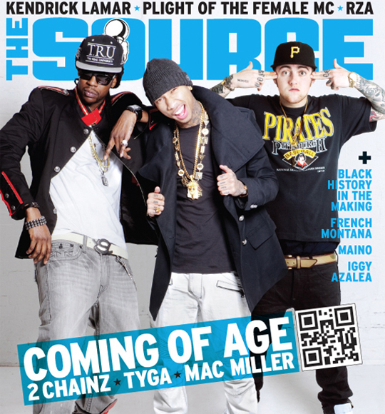
Henceforward, the contents pages main focus is the main image, as on each issue they show a artists who is big at the moment, they use star appeal to grab the reader in, by having ‘Kendrick Lamar’ on the front cover this will appeal to the reader making them know that there is a article about them further on in the magazine.
Kendrick Lamar is seen as a very down to earth artist he doesn’t really fit in with the dominant stereotypes of rappers being over the top with jewellery and having gold teeth etc. Therefore they have to some extent emphasised on this with the mis-en scene of Kendrick Lamar with the way they have dressed him, instead of putting him in bright baggy clothing and making him show off tattoos and even having him topless (which is the ideological view on rappers) they have presented Kendrick Lamar in a very simple way putting him in black clothes and even giving him black jewellery. They have still given Kendrick Lamar Jewellery to reinforce the rich lifestyle that rappers have, however they do to some extent challenge the ideology of how rappers are draped in gold and silver jewellery over the top almost. This appeals to the target audience as the magazine is portraying Kendrick Lamar in a way that the audience views him as and knows him to be. This makes the magazine more believable and not fake. They dress Kendrick Lamar all in black and having less jewellery as this then emphasises on the crown on his head and the message they are trying to send within that. As Kendrick Lamar is in the element of his career some address him and have called him the King of Hip-Hop and the ‘New Generation of Hip Hop’, therefore by having the crown, it uses intertextuality as the audience knows what the crown on his head means straight away. It also gives the audience a sense of what the article about him is going to be about. Kendrick Lamar shows a hostile direct mode of address, this fits in with the crown on the head as Kendrick Lamar gives us the feeling that he is high up in the game.

Throughout all of Source Magazines contents pages, they place the writing (which tells audience which page of the magazine is what) near to the main image, sometimes even overlapping slightly, by having the writing so close to the main image this will make the audience spot the writing as they will firstly navigate to the main image within the focus, soon spotting writing.

Source magazine use the same layout and conventions choices on their contents pages as it creates a brand identity to the target audience, it make them comfortable and familiar with the magazine as they are used to the way the magazine is set out therefore it is easier for them to navigate around the contents page and find the information they are looking for.

XXL Magazine Contents Page Analysis

XXL Magazine Contents Page Analysis

This contents page is from XXL magazine which is a Hip Hop magazine.
XXL magazine do not use the usual title for their contents page, the usual title would be the word ‘contents ‘ however on XXL magazine they consistently use the title ‘The A Side’, which is telling the audience this is where they will find out where everything is. By consistently using this title it creates a trademark to the magazine and appeals to the audience as they will feel comfortable with the way the magazine keeps its usual conventions.
XXL magazine always use the same colour code of White Black and Red, this then fits in with the Logo of the magazine on the front cover (XXL being in a red block in white writing), with these colours, it keeps the magazine consistent and not confusing by having to many colours throughout the magazine. It too gives a quite rich and powerful vibe as these colours together are neutral and connote things like darkness blood which are quite tough and fit in with the genre of Hip-Hop and how the artists are portrayed, it would not appeal as well if the colours where for example green or yellow. By having a consistent colour scheme this creates a brands identity as these colours in a magazine will remind the audience of XXL Magazine.
Furthermore, the main image on the contents is the main focus, the image uses anchorage as on top of the image there is a pull quote from an article within the magazine, it explains why the photo is the way it is and why there is more than one person on the contents (who are not in a band or group). By using anchorage and making it a pull quote it appeals to the audience as they now get an inside of what the article is going to be about, which they might find of interest.
Henceforward, the magazine reinforces the ideology of the bad boy thug image of rappers, as they portray the stereotypes within the pose of the 50 Cent and Soulja Boy. By having both rappers in jewellery this reinforces a certain lifestyle to the audience, not necessarily one they have to abide by, but one that fits in with this genre. They also reinforce the stereotypical image of rappers by showing of Soulja Boys tattoo on his hand.
Both rappers display a hostile mode of address to again reinforce the stereotypical rappers image. Their poses are as well quite hostile and threatening, some may even say boss like (for 50 Cent). By portraying these rappers in these ways it appeals to the target audience as this is what they expect to see from a rapper and those of the Hip Hop genre and this is the way they are portrayed therefore they have to abide by these rules to appeal to their target audience.
More so, the magazine uses a similar layout as Vibe magazine (in my previous analysis’) as their writing around the cover model and keep it to one side of the page instead of scattering it around the page, this is appealing to the audience as it is easy to navigate around the page and find what they are looking for. They keep the writing rather small, we can only suggest they do this as they believe pictures are more interesting and speak more words, therefore they want to emphasis and focus on the photo more, as the ideal demographic may prefer pictures and small quotes to a page full of writing, therefore they keep it small and to one side. They use short and snappy headings for each description of the different pages within the magazine. This makes it more interesting to the reader as it will make them want to see what they heading means and then read on or then locate to the page it is on.
Lastly the magazine uses footer on the page to show a short sentence to tell the audience and give credit to the photographer who did the photo shoot with the rappers. They do this to give credit to the photographer as it is only fair, they have the writing small as the audience are not really interested in this information; however XXL magazine still have to put it there.
Therefore, all these layout choices and conventions used appeal to the audience as by having the contents page consistent in all their magazines it creates a brands identity and gets the audience used to the magazine and makes them more familiar with it.

Vibe Magazine Contents Page Analysis

Vibe Magazine Contents Page Analysis

This contents page is too from Vibe magazine. The cover model is Kanye West.
As we can tell from looking at the previous contents page analysis from Vibe magazine we can see how they maintain the same style layout within their contents pages, they simple rearrange the positions of certain parts slightly to then fit well with the main image.
Therefore, on this contents page they again, show a ‘V’ in the background to show this is a Vibe magazine contents page, and create a brand identity to the magazine as all their magazine contents pages have the ‘V’ in the background. This appeals to the audience as they begin to get comfortable with the usual layout choices of the magazine.
The colour code of this contents page is greyscale and black and white, we can suggest they do this to reinforce a certain lifestyle, as when we think of black and white, we could think of formal wear which could also reinforce to us quite a rich lifestyle. Juxtaposed to this by the use of the colours being greyscale this emphasises on the red heart on Kanye West. When we look closely to the heart we realise there is a woman’s hand trying to grab the heart. The usual connotation of red hearts would be love, and as there is a woman trying to take his heart his expression shows quite a negative mode address as if he is not happy about love or someone taking his heart. They use intertextuality as at the time of this contents page Kanye Wests ideological view of women is to be heartless and heartbreakers and at this time the mood of his songs fit this with hit singles called heartless, love lockdown etc. Therefore portraying Kanye West in this way this appeals to the audience as they know this is how they view Kanye West and what element within his music he is in.
In the last contents page analysis they showed the usual stereotyped of rappers –having many tattoos and a lot of jewellery on. However in this cover they portray Kanye West in a more mature gentleman way, having him in a suit, this could be because Kanye West has never portrayed himself in the typical rapper stereotyped way, therefore he challenges the dominant ideology of rappers being thug like. This will appeal to the audience as it will show them you don’t have to be a certain way to enjoy this magazine, as long as you love the music that is all that matters.
Furthermore, Vibe magazine use their usual layout choices on the magazine; they use the same font and font size for their title ‘contents’, they also locate the writing on the right of the page in small writing, they may do this as by having small writing it does not take the focus of the main image, also we can suggest that most people do not really read the whole contents page, therefore there is no need for the writing to be massive.
Therefore, by Vibe magazine keeping the same layout choices to the magazine this get the audience comfortable with the way the magazine is set out, and makes it easier for them to read the magazine and creates a brand identity to the magazine, making them different from all the other music magazines.

Vibe Magazine Contents Page Analysis

Vibe Magazine Contents Page Analysis

This contents page is from the magazine Vibe, this is their December issue 2008.
Vibe consistently show a ‘V’ on the page which blends in with the background used. They do this too almost create a brand for their magazine, by keeping the same layout choices this will appeal to the audience as from seeing this contents page they will know straight away that this is a contents page from Vibe magazine. They also keep the same styled font and font size on the contents page to also create a brand identity to the demographic.
Henceforward, the iconography of the main image still reinforces the genre of the magazine and reinforces the dominant ideology that rappers are thug like, with plenty tattoos (hence why they have made the rapper topless). The model also has lots of jewellery and diamonds on him, this too reinforces a few dominant ideologies, one being that having money is happiness and also that rappers are usually stereotyped as having lots of jewelry to the point where they are showing off. By reinforcing dominant ideologies and stereotypes within the contents page it shows that they do not just portray these things on the front cover; it is all the way through the magazine. Also it shows the audience the genre of the magazine and appeals to them as this is what they expect to see even if they are false stereotypes.
The writing is all placed to revolve around the main image as some may say the main image is what creates appeal to the contents page otherwise it would just be writing on the page. Therefore they have done a close up on the model –plies- therefore we can focus on him and realise all the stereotypes that are portrayed, they use star appeal.
The writing is located on the left of the page, it is styled in a block/ list type of way. This makes it easy for the audience to find and is better than having the writing scattered all over the page not making it appealing to read. The list writing it typically small compared to everything else on the page, we can suggest they do this as many people may not actually read the contents page as they are genuinely interested in the whole magazine therefore they focus on the main image and showing the demographic that this is a Vibe magazine contents page.
More so, when we look closely at what is written on the contents page, they do not tell us every article that is within the magazine, they simply tell us the main features in the magazine and the fashion side of the magazine. They may do this to separate the two sections of the magazine as some people may not want to read the fashion articles however they tell us the different features within the magazine, so the demographic can look to see a certain feature they may have been waiting to read.
All these conventions and choices to the contents page that Vibe consistently show appeals to the audience as is creates a brand identity to them, as will be ‘comfortable’ to them as they are used to this layout.

Vibe Magazine Front Cover Analysis #3

Vibe Magazine Front Cover Analysis #3

On this cover of magazine Nicki Minaj is the cover model. They allow the cover photo to cover the magazines name, this shows that the cover model is well known and famous, this also shows us that Vibe magazine is a very well known magazine as they will allow themselves to cover their name to promote a celebrity and they have no worries that the audience will not recognise that it is still vibe magazine.
The cover model uses direct mode of address to engage the audience as if the model is looking and talking to them. The use of mis-en scene and they way they have dressed Nicki Minaj the way they have links in with the cover line next to her. Nicki Minaj is presented in a royal was as she is covered up fully and is wearing a crown, her pose is also in a very royal stance. This is anchorage within the text as the text says ‘Nicki Minaj Notorious K.I.N.G’; this explains why Nicki Minaj is dressed and posed this way. However the cover line says ‘Notorious King’ instead of saying Notorious Queen as she is a woman. This is telling us that she in the same league and competition as then men and that she is just as good as the men. This challenges the ideologies that men are more dominant then women and how men are better at everything. However this does fit in with the way rap music is stereotyped as being quite manly music and aggressive therefore with Nicki Minaj being a rap artist, and being a woman they would have to portray her as being quite tough and manly but at the same time keeping her seductive and as a female should be. This will appeal to the audience as it challenges stereotypes and will also appeal to women as a woman is on the cover of a manly genre of a music magazine and how Nicki Minaj has not being sexualized in any way.
Vibe magazine makes the colour code fit in with the colours used for the cover photo; this keeps everything simple and makes nothing overpower anything else. This appeals to the audience as it is simple. Vibe magazine uses any conventions that a typical magazine uses; they have a skyline to promote what interesting articles are inside. They also have a range of different cover lines spotted around the page to give the reader a lot to look at and to show them very many different articles that are inside. They have used bold font on certain words within a cover line to show the audience what the most important part of the article is ‘Why is Drake so angry?’ this emphasises on the article and draws the audience straight to the name Drake creating suspense on what the article may be about.
The use of layout and conventions help to make the magazine appeal to this audience and draw the demographic in.

Rolling Stones Front Cover Analysis

Rolling Stones Front Cover Analysis

Rolling Stones magazine is a rock magazine; however they do introduce artists from different genres of music e.g. Rihanna and Lil Wayne have been on the covers of Rolling Stones magazine. More so, when a different genre artist is on a magazine that does not fit their typical genre, the magazine portrays them in a way that fits well with their magazines genre. For example on a magazine like Vibe Lil Wayne would be portrayed in quite a thug way with lots of gold jewellery and giving quite a hostile mode of address as that is how Hip-Hop artists are stereotyped.
However on this cover they challenge the dominant ideologies of rappers, as Lil Wayne is portrayed and shoes the dominant ideology of a rock star which is -tattoos, topless, the typical styled hat- which they have portrayed Lil Wayne in that way. This appeals to the audience as the usual target audience will be interested in the change over of having a rap artist on a rock magazine. Furthermore, on a typical Hip-Hop magazine, the cover model gives quite a hostile direct mode of address, looking straight at the audience as if they are talking to them. Whereas on this front cover they have used indirect mode of address to portray Lil Wayne in a somewhat sensitive thoughtful way like he has maybe a plan or is in deep thinking, this appeals to the audience as it will give them suspense, wondering why Lil Wayne is on the front cover and what the article is about. They have used anchorage as in the cover line they explain why Lil Wayne is looking this way ‘Lil Wayne Goes Rock, Rap Genius Changes His Game’ this explains to the audience that Lil Wayne is crossing genres and why he is on the cover of a Rolling Stones magazine this will appeal to the audience and also not the usual target audience as Rolling Stones are showing that different genres can cross over and challenging ideologies and stereotypes of people.
As Lil Wayne is not the average person to be shown on a Rolling Stone front cover as he does not fit in with the genre, they have allowed they magazine name/title go over the cover photo, they do this as even though Lil Wayne is very famous and well known he may not be as known in the rock world and genre. Also if they were to put the cover photo in front of the magazines name, the audience may get confused as to why a Hip Hop artist is more important then the name of the magazine, as they are to different genres on one page. However they use a flash button to cover the name of the magazine, this shows that the magazine is still well known as the audience will known that it is Rolling Stones without having to show all the letter of their name. By having the same font for the name of the magazine this creates a brand identity, as this type of font used with any word, the audience would automatically link it to Rolling Stone magazine.
The magazine uses a simple layout and does not use very many conventions and techniques that we would see on a typical magazine cover it has a flash button which shows a important article that is inside the magazine. The front cover then shows the usual list of cover lines showing the audience what they will expect to see inside the magazine. This will appeal to the audience as the cover is simple yet appealing as it shows them what is included in the issue, without overpowering and filling the cover up. Rolling Stones uses simple colours which contrast well together –yellow, white and black, these colours fit well with the cover photo as the do not take the focus of the cover photo and cover lines as they are very neutral colours. Rolling Stones magazine does not stick to the same colour scheme every issue.

The Source Magazine Front Cover Analysis

The Source Magazine Front Cover Analysis

Source magazine is a Hip-Hop magazine created in America. The magazines target demographic is between the ages of 17-25, their ideal audience would be urban out lookers, who are interested in the hip-hop game and probably for those who are working class. When we look at their magazine name ‘the source’ we think what that could mean or what are they trying to tell us within that choice of name. When we look up the word ‘source’ in the dictionary it states it means ‘ A place, person or thing from which something comes or can be obtained’ also ‘Obtain from a particular ‘each type of coffee is sourced from one country’’ therefore we can suggest that when they came up with this name for the magazine they are trying to tell the demographic that their magazine is where the audience can get all the information they will need, and that everything The Source magazine tells us is legit and we can suggest that they believe they are the top magazine who has all the latest information.
By the way the magazine has placed the cover models in front of the title ‘The Source’ this shows us that the cover models are famous and important to the magazine as they are allowing them to cover the title. This also shows that the magazine is a well known magazine as we do not need to see the title of the magazine to know what this magazine is. Usually on a magazine cover we are used to their only being one artist on the cover unless the cover models are a group or band and not 3 separate artists. However we learn why they have done this in the tagline ‘Coming of Age 2Chainz Tyga Mac Miller’, the magazine uses anchorage to show how there is a new age of music that is coming in the Hip-Hop industry. I believe by this tagline The Source magazine is not only saying ‘coming of age’ as they are new artists in the industry but too that, the dominant ideology of Rap music is that artists are black, however they have a white artist on the front cover which shows they are challenging dominant ideologies and showing how ‘coming of Age’ could also show how you do not need a certain skin colour to be apart of a certain genre of music. This will appeal to the audience as it is something new to them and they will want to read more, this also shows the target audience that this magazine is for more types of people then stereotyped.
Furthermore, The Source magazine again challenges the dominant ideology that Hip-Hop artists are angry and quite hostile as one of the artists on the cover look pleasant and not the typical angry and unpleasant selves. However they do reinforce the usual ideology that rappers have lots of tattoos and live a pimped life style as such as they wear lots of chains and gold jewellery. This shows the audience that there is a ‘coming of age’ as some things are different however the usual ideologies and stereotypes will always stay the same.
Henceforward, the magazine uses the usual layout techniques of placing their cover lines around the cover photo. However they do not really use many conventions that a typical magazine would have, they simply have a skyline which introduces us to some of the celebrities that will be in the issue, they have their main story line which links in with the cover photo and lastly they have simple cover lines which tell us the names of people that will be introduced in the magazine. I believe this is quite affective as it is a music magazine people are more interested in the artists who will be involved in the issue, therefore by just simply telling the audience who will be in the issue, this will appeal to very many people as they will see an artists who they may like and then want to know what the article on them is about, it creates suspense to the reader. Also by keeping the front cover simple it does not over power the front cover making it confusing to the audience.